|
|
matplotlib statistics_Examples 68_violinplot_demo. |
H.Kamifuji . |
- violinplot_demo.py
バイオリンプロットの基礎のデモ
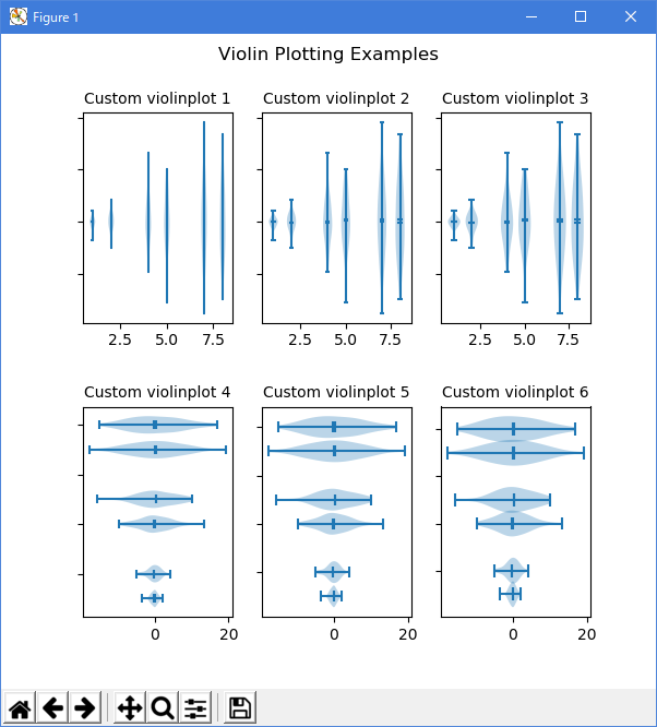
バイオリンプロットは、サンプルの確率分布の抽象的な表現を示す点で、ヒストグラムおよびボックスプロットに似ています。 バイオリンプロットは、ビンに収まるデータポイントの数や統計情報を表示するのではなく、カーネル密度推定(KDE)を使用してサンプルの経験的分布を計算します。 その計算はいくつかのパラメータによって制御されます。 この例では、KDE が評価されるポイント数( "points" )とKDEのバンド幅( "bw_method" )の修正方法を示します。
バイオリンプロットや KDE の詳細については、scikit-learn ドキュメントの素晴らしいセクションがあります:http://scikit-learn.org/stable/modules/density.html
"""
==================================
Demo of the basics of violin plots
==================================

Violin plots are similar to histograms and box plots in that they show
an abstract representation of the probability distribution of the
sample. Rather than showing counts of data points that fall into bins
or order statistics, violin plots use kernel density estimation (KDE) to
compute an empirical distribution of the sample. That computation
is controlled by several parameters. This example demonstrates how to
modify the number of points at which the KDE is evaluated (``points``)
and how to modify the band-width of the KDE (``bw_method``).

For more information on violin plots and KDE, the scikit-learn docs
have a great section: http://scikit-learn.org/stable/modules/density.html
"""

import random
import numpy as np
import matplotlib.pyplot as plt

# fake data
fs = 10  # fontsize
pos = [1, 2, 4, 5, 7, 8]
data = [np.random.normal(0, std, size=100) for std in pos]

fig, axes = plt.subplots(nrows=2, ncols=3, figsize=(6, 6))

axes[0, 0].violinplot(data, pos, points=20, widths=0.3,
                      showmeans=True, showextrema=True, showmedians=True)
axes[0, 0].set_title('Custom violinplot 1', fontsize=fs)

axes[0, 1].violinplot(data, pos, points=40, widths=0.5,
                      showmeans=True, showextrema=True, showmedians=True,
                      bw_method='silverman')
axes[0, 1].set_title('Custom violinplot 2', fontsize=fs)

axes[0, 2].violinplot(data, pos, points=60, widths=0.7, showmeans=True,
                      showextrema=True, showmedians=True, bw_method=0.5)
axes[0, 2].set_title('Custom violinplot 3', fontsize=fs)

axes[1, 0].violinplot(data, pos, points=80, vert=False, widths=0.7,
                      showmeans=True, showextrema=True, showmedians=True)
axes[1, 0].set_title('Custom violinplot 4', fontsize=fs)

axes[1, 1].violinplot(data, pos, points=100, vert=False, widths=0.9,
                      showmeans=True, showextrema=True, showmedians=True,
                      bw_method='silverman')
axes[1, 1].set_title('Custom violinplot 5', fontsize=fs)

axes[1, 2].violinplot(data, pos, points=200, vert=False, widths=1.1,
                      showmeans=True, showextrema=True, showmedians=True,
                      bw_method=0.5)
axes[1, 2].set_title('Custom violinplot 6', fontsize=fs)

for ax in axes.flatten():
    ax.set_yticklabels([])

fig.suptitle("Violin Plotting Examples")
fig.subplots_adjust(hspace=0.4)
plt.show()
- 実行結果( violinplot_demo.png )
- 参照ページ
statistics_Examples code: violinplot_demo.py
- リリースノート
- 2023/04/05 Ver=1.03 Python 3.11.2 で確認
- 2020/11/02 Ver=1.01 Python 3.7.8 で確認
- 2018/12/06 Ver=1.01 初版リリース
- 関連ページ