|
|
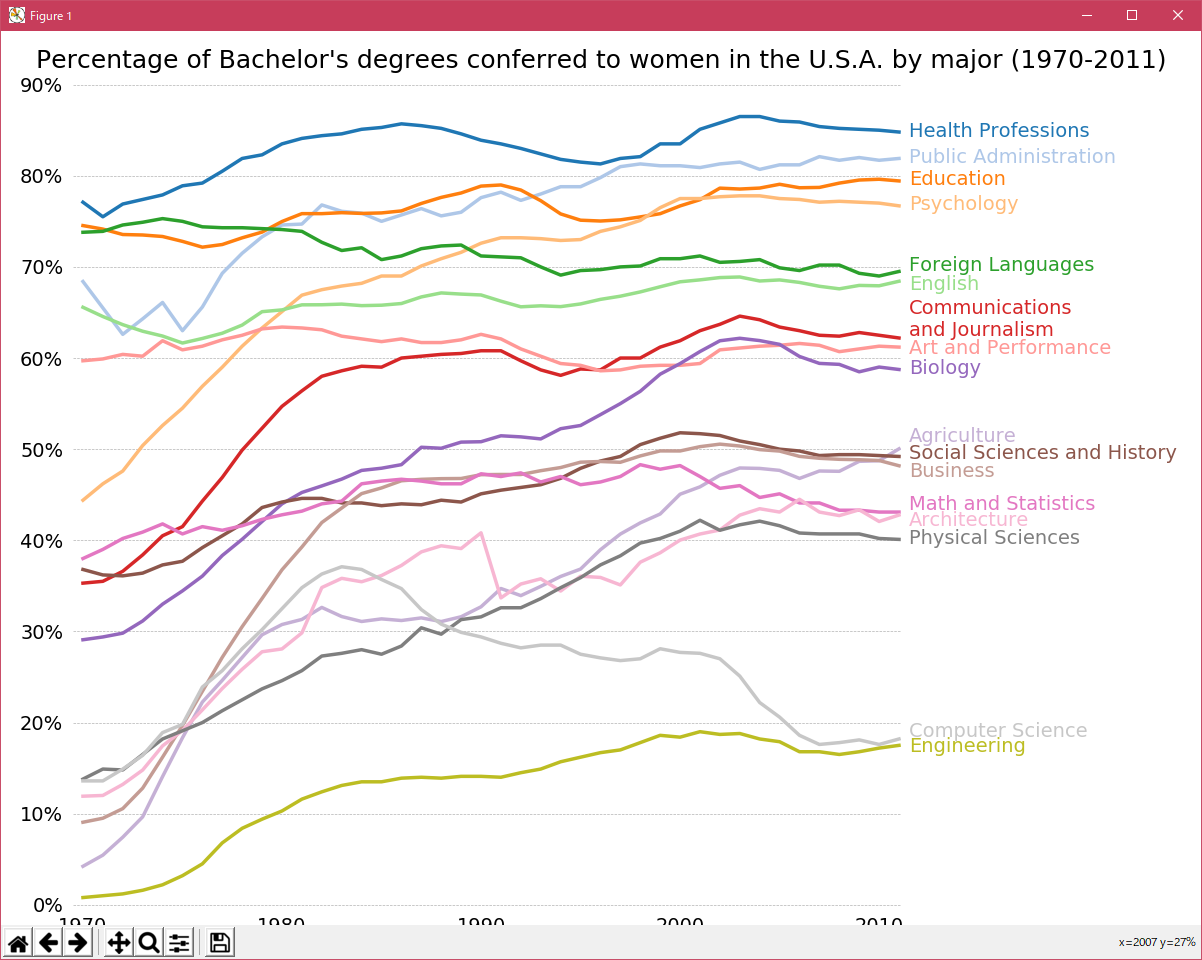
matplotlib showcase_Examples 46_bachelors_degrees_by_gender. |
H.Kamifuji . |
- bachelors_degrees_by_gender.py
この事例は、Windows10_1909 で Python 3.9.0 環境では、動作しません。( from matplotlib.mlab import csv2rec が削除されたのか? )
import matplotlib.pyplot as plt
from matplotlib.mlab import csv2rec
from matplotlib.cbook import get_sample_data

fname = get_sample_data('percent_bachelors_degrees_women_usa.csv')
gender_degree_data = csv2rec(fname)

# These are the colors that will be used in the plot
color_sequence = ['#1f77b4', '#aec7e8', '#ff7f0e', '#ffbb78', '#2ca02c',
                  '#98df8a', '#d62728', '#ff9896', '#9467bd', '#c5b0d5',
                  '#8c564b', '#c49c94', '#e377c2', '#f7b6d2', '#7f7f7f',
                  '#c7c7c7', '#bcbd22', '#dbdb8d', '#17becf', '#9edae5']

# You typically want your plot to be ~1.33x wider than tall. This plot
# is a rare exception because of the number of lines being plotted on it.
# Common sizes: (10, 7.5) and (12, 9)
fig, ax = plt.subplots(1, 1, figsize=(12, 14))

# Remove the plot frame lines. They are unnecessary here.
ax.spines['top'].set_visible(False)
ax.spines['bottom'].set_visible(False)
ax.spines['right'].set_visible(False)
ax.spines['left'].set_visible(False)

# Ensure that the axis ticks only show up on the bottom and left of the plot.
# Ticks on the right and top of the plot are generally unnecessary.
ax.get_xaxis().tick_bottom()
ax.get_yaxis().tick_left()

fig.subplots_adjust(left=.06, right=.75, bottom=.02, top=.94)
# Limit the range of the plot to only where the data is.
# Avoid unnecessary whitespace.
ax.set_xlim(1969.5, 2011.1)
ax.set_ylim(-0.25, 90)

# Make sure your axis ticks are large enough to be easily read.
# You don't want your viewers squinting to read your plot.
plt.xticks(range(1970, 2011, 10), fontsize=14)
plt.yticks(range(0, 91, 10), fontsize=14)
ax.xaxis.set_major_formatter(plt.FuncFormatter('{:.0f}'.format))
ax.yaxis.set_major_formatter(plt.FuncFormatter('{:.0f}%'.format))

# Provide tick lines across the plot to help your viewers trace along
# the axis ticks. Make sure that the lines are light and small so they
# don't obscure the primary data lines.
plt.grid(True, 'major', 'y', ls='--', lw=.5, c='k', alpha=.3)

# Remove the tick marks; they are unnecessary with the tick lines we just
# plotted.
plt.tick_params(axis='both', which='both', bottom='off', top='off',
                labelbottom='on', left='off', right='off', labelleft='on')

# Now that the plot is prepared, it's time to actually plot the data!
# Note that I plotted the majors in order of the highest % in the final year.
majors = ['Health Professions', 'Public Administration', 'Education',
          'Psychology', 'Foreign Languages', 'English',
          'Communications\nand Journalism', 'Art and Performance', 'Biology',
          'Agriculture', 'Social Sciences and History', 'Business',
          'Math and Statistics', 'Architecture', 'Physical Sciences',
          'Computer Science', 'Engineering']

y_offsets = {'Foreign Languages': 0.5, 'English': -0.5,
             'Communications\nand Journalism': 0.75,
             'Art and Performance': -0.25, 'Agriculture': 1.25,
             'Social Sciences and History': 0.25, 'Business': -0.75,
             'Math and Statistics': 0.75, 'Architecture': -0.75,
             'Computer Science': 0.75, 'Engineering': -0.25}

for rank, column in enumerate(majors):
    # Plot each line separately with its own color.
    column_rec_name = column.replace('\n', '_').replace(' ', '_').lower()

    line = plt.plot(gender_degree_data.year,
                    gender_degree_data[column_rec_name],
                    lw=2.5,
                    color=color_sequence[rank])

    # Add a text label to the right end of every line. Most of the code below
    # is adding specific offsets y position because some labels overlapped.
    y_pos = gender_degree_data[column_rec_name][-1] - 0.5

    if column in y_offsets:
        y_pos += y_offsets[column]

    # Again, make sure that all labels are large enough to be easily read
    # by the viewer.
    plt.text(2011.5, y_pos, column, fontsize=14, color=color_sequence[rank])

# Make the title big enough so it spans the entire plot, but don't make it
# so big that it requires two lines to show.

# Note that if the title is descriptive enough, it is unnecessary to include
# axis labels; they are self-evident, in this plot's case.
fig.suptitle('Percentage of Bachelor\'s degrees conferred to women in '
             'the U.S.A. by major (1970-2011)\n', fontsize=18, ha='center')

# Finally, save the figure as a PNG.
# You can also save it as a PDF, JPEG, etc.
# Just change the file extension in this call.
# plt.savefig('percent-bachelors-degrees-women-usa.png', bbox_inches='tight')
plt.show()
- 実行結果( bachelors_degrees_by_gender.png )
Python 3.11.2 見直しました。上記のコードでは、下記のエラーが発生します。
Traceback (most recent call last):
File "_:\bachelors_degrees_by_gender.py", line 2, in <module>
from matplotlib.mlab import csv2rec
ImportError: cannot import name 'csv2rec' from 'matplotlib.mlab' (C:\Users\kamif\AppData\Local\Programs\Python\Python311\Lib\site-packages\matplotlib\mlab.py)
matplotlib 内部のエラーのようです。matplotlib の改修(先祖帰りバグの改修)を待つしかない。
Python 3.11.6 (matplotlib 3.7.1) では、下記のようなエラーがあり、実行できない。
Traceback (most recent call last): File "M:\______\bachelors_degrees_by_gender.py", line 2, in
Python 3.12.0 (matplotlib 3.8.1) では、下記のようなエラーがあり、実行できない。from matplotlib.mlab import csv2rec ImportError: cannot import name 'csv2rec' from 'matplotlib.mlab' (C:\Users\______\AppData\Local\Programs\Python\Python311\Lib \site-packages\matplotlib\mlab.py)
Traceback (most recent call last): File "E:\______\bachelors_degrees_by_gender.py", line 2, in
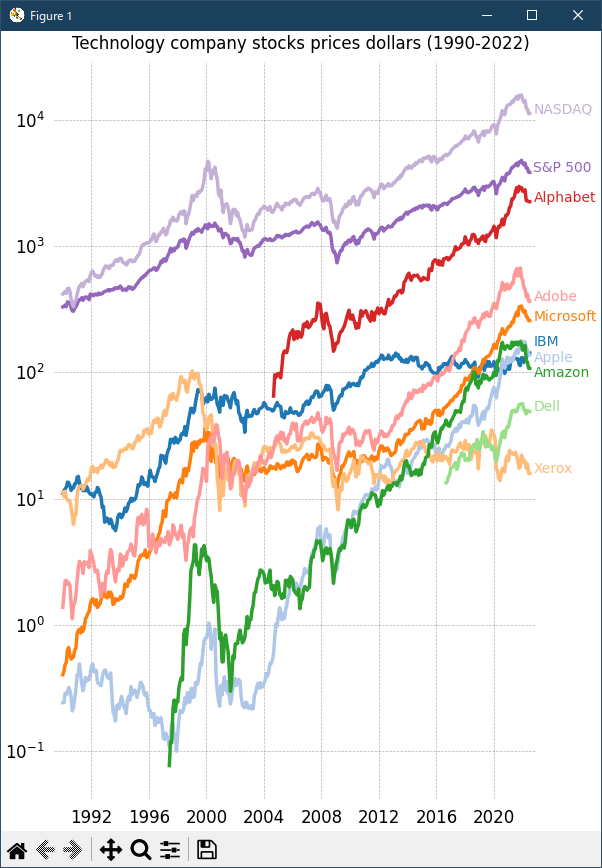
Python 3.11.6 (matplotlib 3.7.1) 及び Python 3.12.0 (matplotlib 3.8.1) で、見直し中、新しいサンプル( showcase-stock-prices-py ) を見つけ、下記のコードで、正常に実行できました。from matplotlib.mlab import csv2rec ImportError: cannot import name 'csv2rec' from 'matplotlib.mlab' (C:\Program Files\Python312\Lib\site-packages\matplotlib\mlab.py)
"""
==========================
Stock prices over 32 years
==========================

.. redirect-from:: /gallery/showcase/bachelors_degrees_by_gender

A graph of multiple time series that demonstrates custom styling of plot frame,
tick lines, tick labels, and line graph properties. It also uses custom
placement of text labels along the right edge as an alternative to a
conventional legend.

Note: The third-party mpl style dufte_ produces similar-looking plots with less
code.

.. _dufte: https://github.com/nschloe/dufte
"""

import matplotlib.pyplot as plt
import numpy as np

from matplotlib.cbook import get_sample_data
import matplotlib.transforms as mtransforms

with get_sample_data('Stocks.csv') as file:
    stock_data = np.genfromtxt(
        file, delimiter=',', names=True, dtype=None,
        converters={0: lambda x: np.datetime64(x, 'D')}, skip_header=1)

fig, ax = plt.subplots(1, 1, figsize=(6, 8), layout='constrained')

# These are the colors that will be used in the plot
ax.set_prop_cycle(color=[
    '#1f77b4', '#aec7e8', '#ff7f0e', '#ffbb78', '#2ca02c', '#98df8a',
    '#d62728', '#ff9896', '#9467bd', '#c5b0d5', '#8c564b', '#c49c94',
    '#e377c2', '#f7b6d2', '#7f7f7f', '#c7c7c7', '#bcbd22', '#dbdb8d',
    '#17becf', '#9edae5'])

stocks_name = ['IBM', 'Apple', 'Microsoft', 'Xerox', 'Amazon', 'Dell',
               'Alphabet', 'Adobe', 'S&P 500', 'NASDAQ']
stocks_ticker = ['IBM', 'AAPL', 'MSFT', 'XRX', 'AMZN', 'DELL', 'GOOGL',
                 'ADBE', 'GSPC', 'IXIC']

# Manually adjust the label positions vertically (units are points = 1/72 inch)
y_offsets = {k: 0 for k in stocks_ticker}
y_offsets['IBM'] = 5
y_offsets['AAPL'] = -5
y_offsets['AMZN'] = -6

for nn, column in enumerate(stocks_ticker):
    # Plot each line separately with its own color.
    # don't include any data with NaN.
    good = np.nonzero(np.isfinite(stock_data[column]))
    line, = ax.plot(stock_data['Date'][good], stock_data[column][good], lw=2.5)

    # Add a text label to the right end of every line. Most of the code below
    # is adding specific offsets y position because some labels overlapped.
    y_pos = stock_data[column][-1]

    # Use an offset transform, in points, for any text that needs to be nudged
    # up or down.
    offset = y_offsets[column] / 72
    trans = mtransforms.ScaledTranslation(0, offset, fig.dpi_scale_trans)
    trans = ax.transData + trans

    # Again, make sure that all labels are large enough to be easily read
    # by the viewer.
    ax.text(np.datetime64('2022-10-01'), y_pos, stocks_name[nn],
            color=line.get_color(), transform=trans)

ax.set_xlim(np.datetime64('1989-06-01'), np.datetime64('2023-01-01'))

fig.suptitle("Technology company stocks prices dollars (1990-2022)",
             ha="center")

# Remove the plot frame lines. They are unnecessary here.
ax.spines[:].set_visible(False)

# Ensure that the axis ticks only show up on the bottom and left of the plot.
# Ticks on the right and top of the plot are generally unnecessary.
ax.xaxis.tick_bottom()
ax.yaxis.tick_left()
ax.set_yscale('log')

# Provide tick lines across the plot to help your viewers trace along
# the axis ticks. Make sure that the lines are light and small so they
# don't obscure the primary data lines.
ax.grid(True, 'major', 'both', ls='--', lw=.5, c='k', alpha=.3)

# Remove the tick marks; they are unnecessary with the tick lines we just
# plotted. Make sure your axis ticks are large enough to be easily read.
# You don't want your viewers squinting to read your plot.
ax.tick_params(axis='both', which='both', labelsize='large',
               bottom=False, top=False, labelbottom=True,
               left=False, right=False, labelleft=True)

# Finally, save the figure as a PNG.
# You can also save it as a PDF, JPEG, etc.
# Just change the file extension in this call.
# fig.savefig('stock-prices.png', bbox_inches='tight')
plt.show()

# %%
#
# .. admonition:: References
#
#    The use of the following functions, methods, classes and modules is shown
#    in this example:
#
#    - `matplotlib.pyplot.subplots`
#    - `matplotlib.axes.Axes.text`
#    - `matplotlib.axis.XAxis.tick_bottom`
#    - `matplotlib.axis.YAxis.tick_left`
#    - `matplotlib.artist.Artist.set_visible`
Python 3.11.6 (matplotlib 3.7.1) 及び Python 3.12.0 (matplotlib 3.8.1) 共に、正常実行です。
- 参照ページ
showcase_Examples code: bachelors_degrees_by_gender.py
showcase-stock-prices-py
- リリースノート
- 2023/12/09 Ver=1.04 Python 3.12.0 (matplotlib 3.8.1)で確認
- 2023/12/09 Ver=1.04 Python 3.11.6 (matplotlib 3.7.1)で確認
- 2023/04/05 Ver=1.03 Python 3.11.2 で確認
- 2020/11/02 Ver=1.01 Python 3.7.8 で確認
- 2018/12/06 Ver=1.01 初版リリース
- 関連ページ