|
| matplotlib Matplotlib Plots. |
H.Kamifuji . |
- 目 次
- Text in Matplotlib Plots
Matplotlib でテキストをプロットして作業する方法について紹介します。
Matplotlib は、数学的表現のサポート、ラスタとベクトル出力のための truetype サポート、任意の回転を伴う改行文字分離、および Unicode サポートを含む幅広いテキストサポートを備えています。
ポストスクリプトや PDF などの出力文書に直接フォントを埋め込むため、画面に表示されるものはハードコピーに収まるものです。 FreeType をサポートすることで、小さなラスターサイズでも見栄えの良い非常に良いアンチエイリアスフォントが作成されます。 matplotlib には、独自の matplotlib.font_manager ( Paul Barlet のおかげで)が含まれています。これは、クロスプラットフォームのW3C準拠のフォント検索アルゴリズムを実装しています。
ユーザーは、rc ファイル に設定された分かりやすいデフォルトで、テキストプロパティ(フォントサイズ、フォントの太さ、テキストの位置と色など)を大幅に制御できます。 matplotlib は、数学的または科学的な数字に興味がある人にとって、TeX の数学記号やコマンドを多数実装しており、数字のどこにでも mathematical expressions (数式) をサポートしています。
- Basic text commands
以下のコマンドは、pyplotインターフェースとオブジェクト指向APIでテキストを作成するために使用されます:
pyplot API OO API description text text Axes の任意の位置に注釈をオプションの矢印とともに追加します。 annotate annotate Axes の任意の位置に注釈をオプションの矢印とともに追加します。 xlabel set_xlabel Axes の x 軸にラベルを追加します。 ylabel set_ylabel Axes の y 軸にラベルを追加します。 title set_title Axes にタイトルを追加します。 figtext text Figure (図) の任意の場所にテキストを追加します。 suptitle suptitle Figure (図) にタイトルを追加します。
これらの関数はすべて、Text インスタンスを作成して返します。これは、さまざまなフォントやその他のプロパティで設定できます。 以下の例は、これらのコマンドのすべての動作を示しています。詳細については、以降のセクションで説明します。
import matplotlib
import matplotlib.pyplot as plt

fig = plt.figure()
fig.suptitle('bold figure suptitle', fontsize=14, fontweight='bold')

ax = fig.add_subplot(111)
fig.subplots_adjust(top=0.85)
ax.set_title('axes title')

ax.set_xlabel('xlabel')
ax.set_ylabel('ylabel')

ax.text(3, 8, 'boxed italics text in data coords', style='italic',
        bbox={'facecolor': 'red', 'alpha': 0.5, 'pad': 10})

ax.text(2, 6, r'an equation: $E=mc^2$', fontsize=15)

ax.text(3, 2, 'unicode: Institut fur Festkorperphysik')

ax.text(0.95, 0.01, 'colored text in axes coords',
        verticalalignment='bottom', horizontalalignment='right',
        transform=ax.transAxes,
        color='green', fontsize=15)


ax.plot([2], [1], 'o')
ax.annotate('annotate', xy=(2, 1), xytext=(3, 4),
            arrowprops=dict(facecolor='black', shrink=0.05))

ax.axis([0, 10, 0, 10])

plt.show()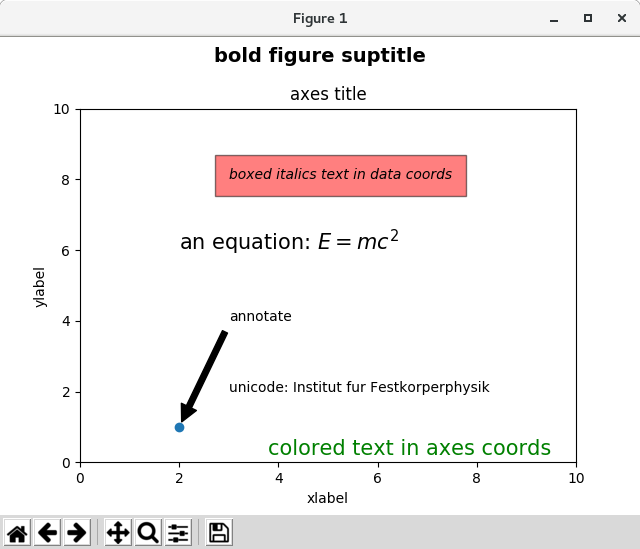
- Labels for x- and y-axis
x 軸と y 軸のラベルを指定するには、set_xlabel メソッドと set_ylabel メソッドを使用する必要があります。
import matplotlib.pyplot as plt
import numpy as np

x1 = np.linspace(0.0, 5.0, 100)
y1 = np.cos(2 * np.pi * x1) * np.exp(-x1)

fig, ax = plt.subplots(figsize=(5, 3))
fig.subplots_adjust(bottom=0.15, left=0.2)
ax.plot(x1, y1)
ax.set_xlabel('time [s]')
ax.set_ylabel('Damped oscillation [V]')

plt.show()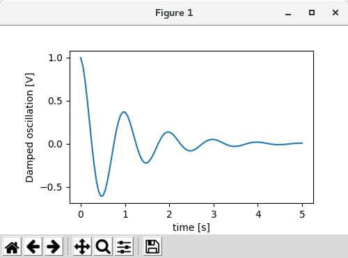
xとyのラベルは自動的に配置され、x と y のティックラベルがクリアされます。 下のプロットと上記のものを比較して、yラベルが上記のものの左側にあることに注意してください。
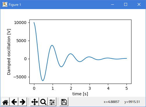
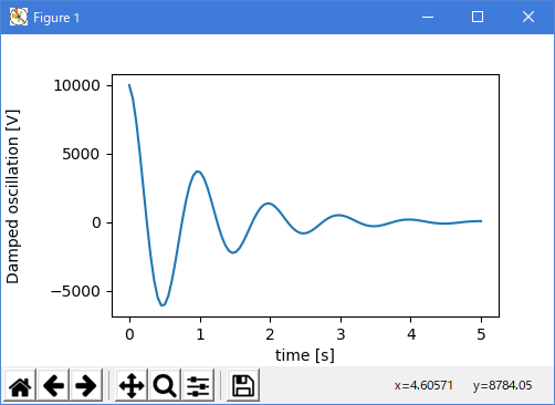
import matplotlib.pyplot as plt
import numpy as np

x1 = np.linspace(0.0, 5.0, 100)
y1 = np.cos(2 * np.pi * x1) * np.exp(-x1)

fig, ax = plt.subplots(figsize=(5, 3))
fig.subplots_adjust(bottom=0.15, left=0.2)
ax.plot(x1, y1*10000)
ax.set_xlabel('time [s]')
ax.set_ylabel('Damped oscillation [V]')

plt.show()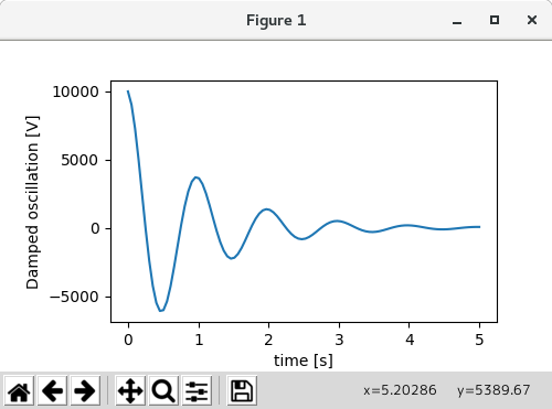
ラベルを移動する場合は、labelpad kyeword 引数を指定します。値はポイント( 1/72 インチ、フォント単位の指定に使用される単位)です。
import matplotlib.pyplot as plt
import numpy as np

x1 = np.linspace(0.0, 5.0, 100)
y1 = np.cos(2 * np.pi * x1) * np.exp(-x1)

fig, ax = plt.subplots(figsize=(5, 3))
fig.subplots_adjust(bottom=0.15, left=0.2)
ax.plot(x1, y1*10000)
ax.set_xlabel('time [s]')
ax.set_ylabel('Damped oscillation [V]', labelpad=18)

plt.show()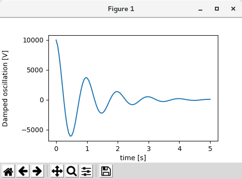
または、ラベルは、位置を含むすべての Text キーワード引数を受け入れます。これを介して、手動でラベルの位置を指定できます。 ここでは xlabel を軸の最も左に置きます。 この位置の y 座標は効果がないことに注意してください. y 位置を調整するには、labelpad kwarg を使用する必要があります。
import matplotlib.pyplot as plt
import numpy as np

x1 = np.linspace(0.0, 5.0, 100)
y1 = np.cos(2 * np.pi * x1) * np.exp(-x1)

fig, ax = plt.subplots(figsize=(5, 3))
fig.subplots_adjust(bottom=0.15, left=0.2)
ax.plot(x1, y1)
ax.set_xlabel('time [s]', position=(0., 1e6),
                      horizontalalignment='left')
ax.set_ylabel('Damped oscillation [V]')

plt.show()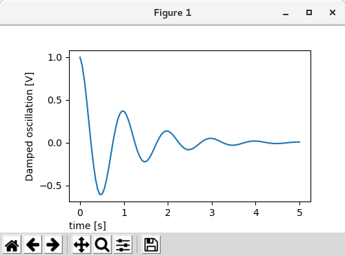
このチュートリアルのすべてのラベルは、matplotlib.font_manager.FontProperties メソッドを操作するか、kwargs から set_xlabel という名前を付けて変更することができます
import matplotlib.pyplot as plt
import numpy as np
from matplotlib.font_manager import FontProperties

x1 = np.linspace(0.0, 5.0, 100)
y1 = np.cos(2 * np.pi * x1) * np.exp(-x1)

font = FontProperties()
font.set_family('serif')
font.set_name('Times New Roman')
font.set_style('italic')

fig, ax = plt.subplots(figsize=(5, 3))
fig.subplots_adjust(bottom=0.15, left=0.2)
ax.plot(x1, y1)
ax.set_xlabel('time [s]', fontsize='large', fontweight='bold')
ax.set_ylabel('Damped oscillation [V]', fontproperties=font)


plt.show()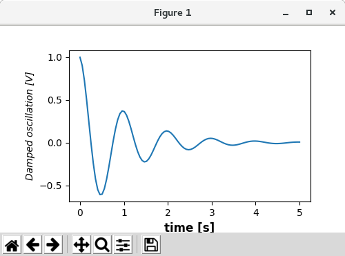
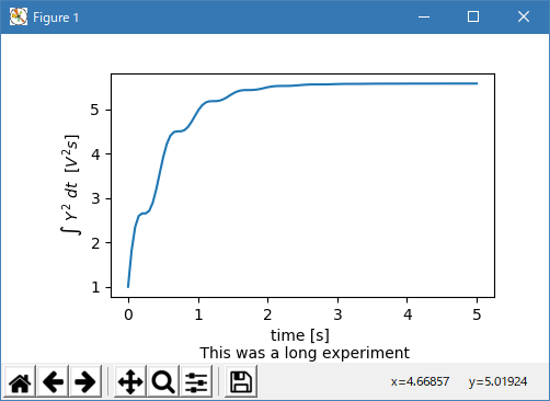
最後に、すべてのテキストオブジェクトでネイティブ TeX レンダリングを使用し、複数の行を使用できます。
import matplotlib.pyplot as plt
import numpy as np
from matplotlib.font_manager import FontProperties

x1 = np.linspace(0.0, 5.0, 100)
y1 = np.cos(2 * np.pi * x1) * np.exp(-x1)

fig, ax = plt.subplots(figsize=(5, 3))
fig.subplots_adjust(bottom=0.2, left=0.2)
ax.plot(x1, np.cumsum(y1**2))
ax.set_xlabel('time [s] \n This was a long experiment')
ax.set_ylabel(r'$\int\ Y^2\ dt\ \ [V^2 s]$')


plt.show()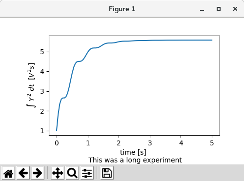
- Titles
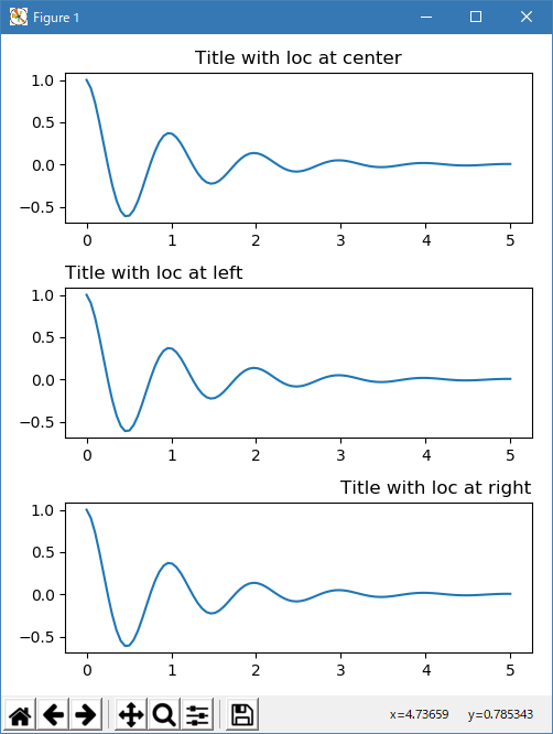
サブプロットのタイトルはラベルとほぼ同じ方法で設定されますが、loc と center のデフォルト値から位置と位置揃えを変更できる loc キーワード引数があります。
import matplotlib.pyplot as plt
import numpy as np
from matplotlib.font_manager import FontProperties

x1 = np.linspace(0.0, 5.0, 100)
y1 = np.cos(2 * np.pi * x1) * np.exp(-x1)

fig, axs = plt.subplots(3, 1, figsize=(5, 6), tight_layout=True)
locs = ['center', 'left', 'right']
for ax, loc in zip(axs, locs):
    ax.plot(x1, y1)
    ax.set_title('Title with loc at '+loc, loc=loc)

plt.show()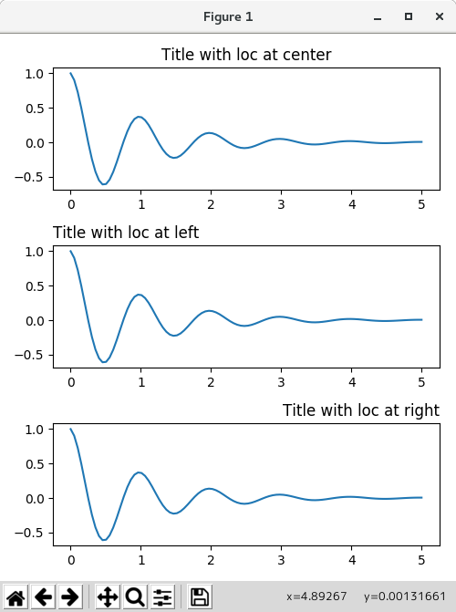
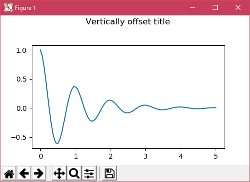
タイトルの垂直スペーシングは rcParams [axes.titlepad] で制御されます。デフォルトは5ポイントです。 異なる値に設定するとタイトルが移動します。
import matplotlib.pyplot as plt
import numpy as np
from matplotlib.font_manager import FontProperties

x1 = np.linspace(0.0, 5.0, 100)
y1 = np.cos(2 * np.pi * x1) * np.exp(-x1)

fig, ax = plt.subplots(figsize=(5, 3))
fig.subplots_adjust(top=0.8)
ax.plot(x1, y1)
ax.set_title('Vertically offset title', pad=30)

plt.show()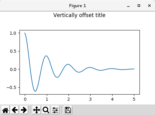
- Ticks and ticklabels
ティックとティックラベルを配置することは、人物を作るのは非常に面倒なことです。 Matplotlib は自動的に最高の機能を発揮しますが、ティックの位置とそのラベル付け方法を決定するための非常に柔軟なフレームワークも提供します。
- Terminology
軸には、ax.xaxis と ax.yaxis の matplotlib.axis オブジェクトがあり、軸のラベルの配置方法に関する情報が含まれています。
axis API の詳細は、ドキュメントを軸に説明しています。
Axis オブジェクトには、大小のダニがあります。 Axisに は、メジャーおよびマイナーダニの位置を決定するためにプロットされるデータを使用する matplotlib.xaxis.set_major_locator および matplotlib.xaxis.set_minor_locator メソッドがあります。 目盛りのラベルを整形する matplotlib.xaxis.set_major_formatter メソッドと matplotlib.xaxis.set_minor_formattersメ ソッドもあります。
- Simple ticks
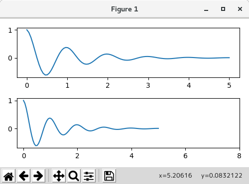
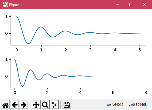
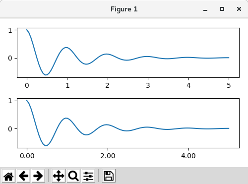
デフォルトのロケータとフォーマッタをオーバーライドするだけで、ティック値、時にはティックラベルを定義するのが便利なことがよくあります。 これはプロットの反復的なナビゲーションを壊すため、これはお勧めできません。 また、軸の限界をリセットすることもできます: 2 番目のプロットには、自動ビューの限界をはるかに超えているものも含めて、私たちが求めたティックがあります。
import matplotlib.pyplot as plt
import numpy as np
from matplotlib.font_manager import FontProperties

x1 = np.linspace(0.0, 5.0, 100)
y1 = np.cos(2 * np.pi * x1) * np.exp(-x1)

fig, axs = plt.subplots(2, 1, figsize=(5, 3), tight_layout=True)
axs[0].plot(x1, y1)
axs[1].plot(x1, y1)
axs[1].xaxis.set_ticks(np.arange(0., 8.1, 2.))

plt.show()
事実の後でこれを修正することはもちろん可能ですが、ティックをハードコーディングすることの弱点を強調しています。 この例では、ティックのフォーマットも変更されます。
import matplotlib.pyplot as plt
import numpy as np
from matplotlib.font_manager import FontProperties

x1 = np.linspace(0.0, 5.0, 100)
y1 = np.cos(2 * np.pi * x1) * np.exp(-x1)

fig, axs = plt.subplots(2, 1, figsize=(5, 3), tight_layout=True)
axs[0].plot(x1, y1)
axs[1].plot(x1, y1)
ticks = np.arange(0., 8.1, 2.)
# list comprehension to get all tick labels...
tickla = ['%1.2f' % tick for tick in ticks]
axs[1].xaxis.set_ticks(ticks)
axs[1].xaxis.set_ticklabels(tickla)
axs[1].set_xlim(axs[0].get_xlim())

plt.show()
- Tick Locators and Formatters
すべてのティカルベルのリストを作る代わりに、matplotlib.ticker.FormatStrFormatter を使って ax.xaxis に渡すことができました
import matplotlib
import matplotlib.pyplot as plt
import numpy as np
from matplotlib.font_manager import FontProperties

x1 = np.linspace(0.0, 5.0, 100)
y1 = np.cos(2 * np.pi * x1) * np.exp(-x1)

fig, axs = plt.subplots(2, 1, figsize=(5, 3), tight_layout=True)
axs[0].plot(x1, y1)
axs[1].plot(x1, y1)
ticks = np.arange(0., 8.1, 2.)
# list comprehension to get all tick labels...
formatter = matplotlib.ticker.StrMethodFormatter('{x:1.1f}')
axs[1].xaxis.set_ticks(ticks)
axs[1].xaxis.set_major_formatter(formatter)
axs[1].set_xlim(axs[0].get_xlim())

plt.show()
もちろん、ティックの位置を設定するためにデフォルト以外のロケータを使用することもできます。 ティック値は引き続き使用しますが、上記で使用したx-limitフィックスは必要ありません。
import matplotlib
import matplotlib.pyplot as plt
import numpy as np
from matplotlib.font_manager import FontProperties

x1 = np.linspace(0.0, 5.0, 100)
y1 = np.cos(2 * np.pi * x1) * np.exp(-x1)

fig, axs = plt.subplots(2, 1, figsize=(5, 3), tight_layout=True)
axs[0].plot(x1, y1)
axs[1].plot(x1, y1)
ticks = np.arange(0., 8.1, 2.)

formatter = matplotlib.ticker.FormatStrFormatter('%1.1f')
locator = matplotlib.ticker.FixedLocator(ticks)
axs[1].xaxis.set_major_locator(locator)
axs[1].xaxis.set_major_formatter(formatter)

plt.show()

デフォルトのフォーマッタは、ticker.MaxNLocator(self、nbins = 'auto'、steps = [1,2,2.5,5,10])という名前の matplotlib.ticker.MaxNLocator です。steps キーワードには、使用可能な複数のリストが含まれています ティック値の場合 すなわち、この場合、2,4,6 は 20,40,60 または 0.2,0.4,0.6 と同様に許容されるダニである。 しかし、3,6,9 は、3 がステップのリストに現れないため、受け入れられません。
nbins = auto はアルゴリズムを使用して、軸の長さに基づいて受け入れられるティックの数を決定します。 ティックラベルのフォントサイズは考慮されていますが、ティック文字列の長さは決まっていません(そのためまだわかりません)。最下行のティックラベルはかなり大きいので、nbins = 4 に設定して 右のプロット。
import matplotlib
import matplotlib.pyplot as plt
import numpy as np
from matplotlib.font_manager import FontProperties

x1 = np.linspace(0.0, 5.0, 100)
y1 = np.cos(2 * np.pi * x1) * np.exp(-x1)

fig, axs = plt.subplots(2, 2, figsize=(8, 5), tight_layout=True)
axs = axs.flatten()
for n, ax in enumerate(axs):
    ax.plot(x1*10., y1)

formatter = matplotlib.ticker.FormatStrFormatter('%1.1f')
locator = matplotlib.ticker.MaxNLocator(nbins='auto', steps=[1, 4, 10])
axs[1].xaxis.set_major_locator(locator)
axs[1].xaxis.set_major_formatter(formatter)

formatter = matplotlib.ticker.FormatStrFormatter('%1.5f')
locator = matplotlib.ticker.AutoLocator()
axs[2].xaxis.set_major_formatter(formatter)
axs[2].xaxis.set_major_locator(locator)

formatter = matplotlib.ticker.FormatStrFormatter('%1.5f')
locator = matplotlib.ticker.MaxNLocator(nbins=4)
axs[3].xaxis.set_major_formatter(formatter)
axs[3].xaxis.set_major_locator(locator)

plt.show()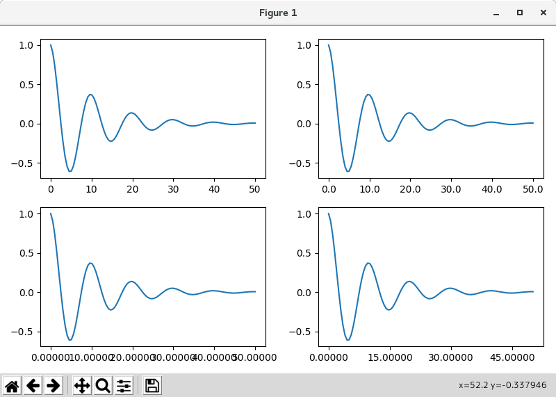

最後に、matplotlib.ticker.FuncFormatter を使用してフォーマッタの関数を指定することができます。
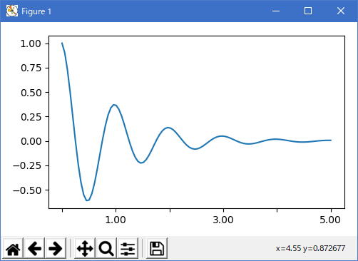
import matplotlib
import matplotlib.pyplot as plt
import numpy as np
from matplotlib.font_manager import FontProperties

x1 = np.linspace(0.0, 5.0, 100)
y1 = np.cos(2 * np.pi * x1) * np.exp(-x1)

def formatoddticks(x, pos):
    """Format odd tick positions
    """
    if x % 2:
        return '%1.2f' % x
    else:
        return ''

fig, ax = plt.subplots(figsize=(5, 3), tight_layout=True)
ax.plot(x1, y1)
formatter = matplotlib.ticker.FuncFormatter(formatoddticks)
locator = matplotlib.ticker.MaxNLocator(nbins=6)
ax.xaxis.set_major_formatter(formatter)
ax.xaxis.set_major_locator(locator)

plt.show()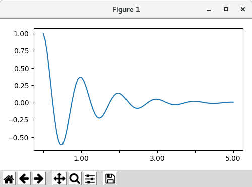
- Dateticks
Matplotlib は、プロット引数として datetime.datetime オブジェクトと numpy.datetime64 オブジェクトを受け入れることができます。 日付と時刻には特殊な書式設定が必要です。手動の介入が有効な場合があります。 日付を助けるために、日付には、matplotlib.dates モジュールで定義されているスペクトル Locator と Formatters があります。
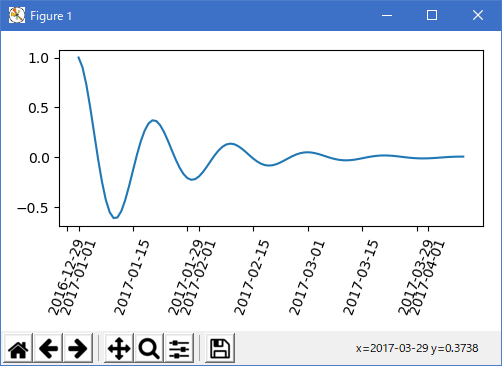
簡単な例は次のとおりです。 目盛りのラベルをどのように回転させて、お互いがあふれないようにするか注意してください。
import matplotlib
import matplotlib.pyplot as plt
import numpy as np
from matplotlib.font_manager import FontProperties
import datetime

x1 = np.linspace(0.0, 5.0, 100)
y1 = np.cos(2 * np.pi * x1) * np.exp(-x1)

fig, ax = plt.subplots(figsize=(5, 3), tight_layout=True)
base = datetime.datetime(2017, 1, 1, 0, 0, 1)
time = [base + datetime.timedelta(days=x) for x in range(len(y1))]

ax.plot(time, y1)
ax.tick_params(axis='x', rotation=70)

plt.show()
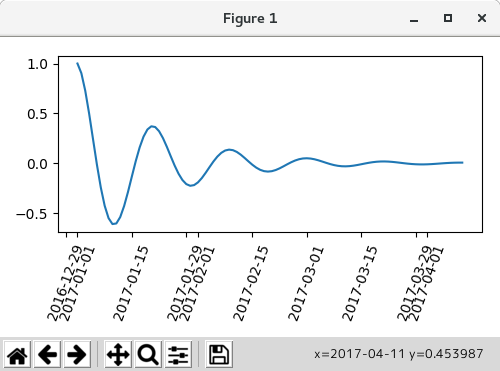
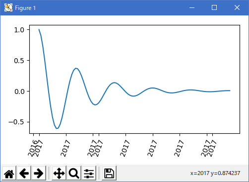
上のラベルのフォーマットは受け入れられるかもしれませんが、選択肢はむしろ独特のものです。 matplotlib.dates.AutoDateLocator を変更することで、月の初めにティックを倒すことができます
import matplotlib
import matplotlib.pyplot as plt
import numpy as np
from matplotlib.font_manager import FontProperties
import datetime
import matplotlib.dates as mdates

x1 = np.linspace(0.0, 5.0, 100)
y1 = np.cos(2 * np.pi * x1) * np.exp(-x1)


locator = mdates.AutoDateLocator(interval_multiples=True)
base = datetime.datetime(2017, 1, 1, 0, 0, 1)
time = [base + datetime.timedelta(days=x) for x in range(len(y1))]

fig, ax = plt.subplots(figsize=(5, 3), tight_layout=True)
ax.xaxis.set_major_locator(locator)
ax.plot(time, y1)
ax.tick_params(axis='x', rotation=70)

plt.show()

ただし、これにより目盛りのラベルが変更されます。 最も簡単な修正は matplotlib.dates.DateFormatter にフォーマットを渡すことです。 また、29 日と翌月は非常に近いことに注意してください。 これを修正するには、dates.DayLocator クラスを使用します。これにより、使用する月の日のリストを指定できます。 同様のフォーマッタは matplotlib.dates モジュールにリストされています。
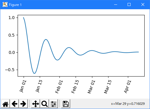
import matplotlib
import matplotlib.pyplot as plt
import numpy as np
from matplotlib.font_manager import FontProperties
import datetime
import matplotlib.dates as mdates

x1 = np.linspace(0.0, 5.0, 100)
y1 = np.cos(2 * np.pi * x1) * np.exp(-x1)


# locator = mdates.AutoDateLocator(interval_multiples=True)
locator = mdates.DayLocator(bymonthday=[1, 15])
base = datetime.datetime(2017, 1, 1, 0, 0, 1)
time = [base + datetime.timedelta(days=x) for x in range(len(y1))]
formatter = mdates.DateFormatter('%b %d')


fig, ax = plt.subplots(figsize=(5, 3), tight_layout=True)
ax.xaxis.set_major_locator(locator)
ax.xaxis.set_major_formatter(formatter)
ax.plot(time, y1)
ax.tick_params(axis='x', rotation=70)

plt.show()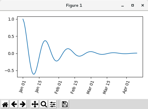
- Legends and Annotations
- Legends: Legend guide
- Annotations: Annotations
- 参照ページ
Matplotlib Plots
- リリースノート
- 2023/03/11 Ver=1.03 Python 3.11.2 で確認
- 2020/10/28 Ver=1.01 Python 3.7.8 で確認
- 2018/11/08 Ver=1.01 初版リリース
- 関連ページ