|
| matplotlib The Lifecycle of a Plot. |
H.Kamifuji . |
- The Lifecycle of a Plot
このチュートリアルでは、Matplotlibを使用して単一のビジュアライゼーションの開始、途中、終了を表示することを目的としています。 いくつかの生データから始め、カスタマイズされた視覚化の図を保存して終了します。 途中で、Matplotlib を使っていくつかのすっきりした機能やベストプラクティスを紹介しようとします。
注意
このチュートリアルは Chris Moffitt のこの優れたブログ投稿 に基づいています。 それは Chris Holdgraf によってこのチュートリアルに変換されました
- 目 次
- A note on the Object-Oriented API vs Pyplot
Matplotlib には 2 つのインタフェースがあります。 1 つはオブジェクト指向(OO)インタフェースです。 この場合、figure.Figure. のインスタンスに視覚化をレンダリングするために axes.Axes のインスタンスを使用します。
2 番目は MATLAB に基づいており、状態ベースのインタフェースを使用しています。 これは pyplot モジュールにカプセル化されています。 pyplot のインタフェースについては、pyplot のチュートリアルを参照してください。
ほとんどの用語は単純ですが、覚えておくべき重要なことは次のとおりです。
- Figure は、1つ以上の Axes を含む最終的なイメージです。
- Axes は個々のプロットを表します(プロットのx / y 軸を指す "axis" という単語と混同しないでください)。
注意
一般的には、pyplot インターフェイス上でオブジェクト指向のインターフェイスを使用しようとします。
- Our data
このチュートリアルが派生したポストのデータを使用します。 これには多数の企業の販売情報が含まれています。
# sphinx_gallery_thumbnail_number = 10
import numpy as np
import matplotlib.pyplot as plt
from matplotlib.ticker import FuncFormatter

data = {'Barton LLC': 109438.50,
        'Frami, Hills and Schmidt': 103569.59,
        'Fritsch, Russel and Anderson': 112214.71,
        'Jerde-Hilpert': 112591.43,
        'Keeling LLC': 100934.30,
        'Koepp Ltd': 103660.54,
        'Kulas Inc': 137351.96,
        'Trantow-Barrows': 123381.38,
        'White-Trantow': 135841.99,
        'Will LLC': 104437.60}
group_data = list(data.values())
group_names = list(data.keys())
group_mean = np.mean(group_data)
- Getting started
このデータは、自然にバープロットとして視覚化され、グループごとに1つのバーがあります。 オブジェクト指向のアプローチでこれを行うには、まず figure.Figure と axes.Axes のインスタンスを生成します。 Figure はキャンバスに似ていて、Axesは 特定の視覚化を行うキャンバスの一部です。
注意
図は複数の軸を持つことができます。 これを行う方法については、Tight Layout チュートリアル を参照してください。
# sphinx_gallery_thumbnail_number = 10
import numpy as np
import matplotlib.pyplot as plt
from matplotlib.ticker import FuncFormatter

data = {'Barton LLC': 109438.50,
        'Frami, Hills and Schmidt': 103569.59,
        'Fritsch, Russel and Anderson': 112214.71,
        'Jerde-Hilpert': 112591.43,
        'Keeling LLC': 100934.30,
        'Koepp Ltd': 103660.54,
        'Kulas Inc': 137351.96,
        'Trantow-Barrows': 123381.38,
        'White-Trantow': 135841.99,
        'Will LLC': 104437.60}
group_data = list(data.values())
group_names = list(data.keys())
group_mean = np.mean(group_data)

fig, ax = plt.subplots()

plt.show()
Axes インスタンスがあるので、その上にプロットすることができます。
# sphinx_gallery_thumbnail_number = 10
import numpy as np
import matplotlib.pyplot as plt
from matplotlib.ticker import FuncFormatter

data = {'Barton LLC': 109438.50,
        'Frami, Hills and Schmidt': 103569.59,
        'Fritsch, Russel and Anderson': 112214.71,
        'Jerde-Hilpert': 112591.43,
        'Keeling LLC': 100934.30,
        'Koepp Ltd': 103660.54,
        'Kulas Inc': 137351.96,
        'Trantow-Barrows': 123381.38,
        'White-Trantow': 135841.99,
        'Will LLC': 104437.60}
group_data = list(data.values())
group_names = list(data.keys())
group_mean = np.mean(group_data)

fig, ax = plt.subplots()
ax.barh(group_names, group_data)

plt.show()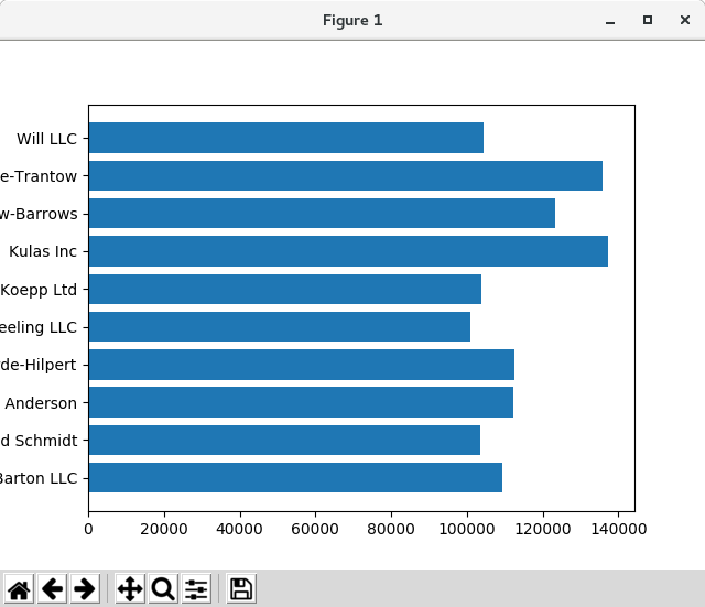

- Controlling the style
Matplotlib には多くのスタイルが用意されており、必要に応じて視覚化することができます。 スタイルのリストを見るために、pyplot.style を使うことができます。
print(plt.style.available)
出力
['seaborn-ticks', 'ggplot', 'dark_background', 'bmh', 'seaborn-poster', 'seaborn-notebook', 'fast', 'seaborn', 'classic', 'Solarize_Light2', 'seaborn-dark', 'seaborn-pastel', 'seaborn-muted', '_classic_test', 'seaborn-paper', 'seaborn-colorblind', 'seaborn-bright', 'seaborn-talk', 'seaborn-dark-palette', 'tableau-colorblind10', 'seaborn-darkgrid', 'seaborn-whitegrid', 'fivethirtyeight', 'grayscale', 'seaborn-white', 'seaborn-deep']次のようにスタイルをアクティブにすることができます:
plt.style.use('fivethirtyeight')上記のプロットを見直して見てみましょう:
# sphinx_gallery_thumbnail_number = 10
import numpy as np
import matplotlib.pyplot as plt
from matplotlib.ticker import FuncFormatter

data = {'Barton LLC': 109438.50,
        'Frami, Hills and Schmidt': 103569.59,
        'Fritsch, Russel and Anderson': 112214.71,
        'Jerde-Hilpert': 112591.43,
        'Keeling LLC': 100934.30,
        'Koepp Ltd': 103660.54,
        'Kulas Inc': 137351.96,
        'Trantow-Barrows': 123381.38,
        'White-Trantow': 135841.99,
        'Will LLC': 104437.60}
group_data = list(data.values())
group_names = list(data.keys())
group_mean = np.mean(group_data)

print(plt.style.available)

plt.style.use('fivethirtyeight')

fig, ax = plt.subplots()
ax.barh(group_names, group_data)

plt.show()

スタイルは、色、線幅、背景など、多くのものを制御します。
- Customizing the plot
今、私たちが望む一般的な外観のプロットがありますので、印刷の準備が整うように微調整しましょう。 まず、x 軸のラベルを回転させて、より明瞭に表示させます。 axes.Axes.get_xticklabels() メソッドでこれらのラベルにアクセスできます:
# sphinx_gallery_thumbnail_number = 10
import numpy as np
import matplotlib.pyplot as plt
from matplotlib.ticker import FuncFormatter

data = {'Barton LLC': 109438.50,
        'Frami, Hills and Schmidt': 103569.59,
        'Fritsch, Russel and Anderson': 112214.71,
        'Jerde-Hilpert': 112591.43,
        'Keeling LLC': 100934.30,
        'Koepp Ltd': 103660.54,
        'Kulas Inc': 137351.96,
        'Trantow-Barrows': 123381.38,
        'White-Trantow': 135841.99,
        'Will LLC': 104437.60}
group_data = list(data.values())
group_names = list(data.keys())
group_mean = np.mean(group_data)

print(plt.style.available)

plt.style.use('fivethirtyeight')

fig, ax = plt.subplots()
ax.barh(group_names, group_data)

plt.show()
一度に多くの項目のプロパティを設定したい場合は、pyplot.setp() 関数を使用すると便利です。 これは、Matplotlib オブジェクトのリスト(または多くのリスト)を取り、それぞれのスタイル要素を設定しようとします。
# sphinx_gallery_thumbnail_number = 10
import numpy as np
import matplotlib.pyplot as plt
from matplotlib.ticker import FuncFormatter

data = {'Barton LLC': 109438.50,
        'Frami, Hills and Schmidt': 103569.59,
        'Fritsch, Russel and Anderson': 112214.71,
        'Jerde-Hilpert': 112591.43,
        'Keeling LLC': 100934.30,
        'Koepp Ltd': 103660.54,
        'Kulas Inc': 137351.96,
        'Trantow-Barrows': 123381.38,
        'White-Trantow': 135841.99,
        'Will LLC': 104437.60}
group_data = list(data.values())
group_names = list(data.keys())
group_mean = np.mean(group_data)

fig, ax = plt.subplots()
ax.barh(group_names, group_data)
labels = ax.get_xticklabels()
plt.setp(labels, rotation=45, horizontalalignment='right')

plt.show()

これは、下のラベルのいくつかをカットするように見えます。 Matplotlib に、私たちが作成したフィギュアの要素のためのスペースを自動的に作るように指示できます。 これを行うために、rcParams の自動レイアウト値を設定します。 rcParams によるスタイル、レイアウト、およびその他のプロットの機能の制御の詳細については、「スタイルシートと rcParams を使用した Matplotlib のカスタマイズ」 を参照してください。
# sphinx_gallery_thumbnail_number = 10
import numpy as np
import matplotlib.pyplot as plt
from matplotlib.ticker import FuncFormatter

data = {'Barton LLC': 109438.50,
        'Frami, Hills and Schmidt': 103569.59,
        'Fritsch, Russel and Anderson': 112214.71,
        'Jerde-Hilpert': 112591.43,
        'Keeling LLC': 100934.30,
        'Koepp Ltd': 103660.54,
        'Kulas Inc': 137351.96,
        'Trantow-Barrows': 123381.38,
        'White-Trantow': 135841.99,
        'Will LLC': 104437.60}
group_data = list(data.values())
group_names = list(data.keys())
group_mean = np.mean(group_data)

plt.rcParams.update({'figure.autolayout': True})

fig, ax = plt.subplots()
ax.barh(group_names, group_data)
labels = ax.get_xticklabels()
plt.setp(labels, rotation=45, horizontalalignment='right')

plt.show()

次に、ラベルをプロットに追加します。 オブジェクト指向インタフェースでこれを行うには、axes.Axes.set() メソッドを使用してこの Axes オブジェクトのプロパティを設定します。
# sphinx_gallery_thumbnail_number = 10
import numpy as np
import matplotlib.pyplot as plt
from matplotlib.ticker import FuncFormatter

data = {'Barton LLC': 109438.50,
        'Frami, Hills and Schmidt': 103569.59,
        'Fritsch, Russel and Anderson': 112214.71,
        'Jerde-Hilpert': 112591.43,
        'Keeling LLC': 100934.30,
        'Koepp Ltd': 103660.54,
        'Kulas Inc': 137351.96,
        'Trantow-Barrows': 123381.38,
        'White-Trantow': 135841.99,
        'Will LLC': 104437.60}
group_data = list(data.values())
group_names = list(data.keys())
group_mean = np.mean(group_data)

plt.rcParams.update({'figure.autolayout': True})

fig, ax = plt.subplots()
ax.barh(group_names, group_data)
labels = ax.get_xticklabels()
plt.setp(labels, rotation=45, horizontalalignment='right')
ax.set(xlim=[-10000, 140000], xlabel='Total Revenue', ylabel='Company',
       title='Company Revenue')

plt.show()

pyplot.subplots() 関数を使用してこのプロットのサイズを調整することもできます。 私たちは figsize kwarg でこれを行うことができます。
注意
NumPyのインデックスはフォーム(行、列)に従いますが、figsize kwargはフォーム(幅、高さ)に従います。 これは、残念ながら線形代数のものとは異なる可視化の規則に従います。# sphinx_gallery_thumbnail_number = 10 import numpy as np import matplotlib.pyplot as plt from matplotlib.ticker import FuncFormatter data = {'Barton LLC': 109438.50, 'Frami, Hills and Schmidt': 103569.59, 'Fritsch, Russel and Anderson': 112214.71, 'Jerde-Hilpert': 112591.43, 'Keeling LLC': 100934.30, 'Koepp Ltd': 103660.54, 'Kulas Inc': 137351.96, 'Trantow-Barrows': 123381.38, 'White-Trantow': 135841.99, 'Will LLC': 104437.60} group_data = list(data.values()) group_names = list(data.keys()) group_mean = np.mean(group_data) plt.rcParams.update({'figure.autolayout': True}) fig, ax = plt.subplots(figsize=(8, 4)) ax.barh(group_names, group_data) labels = ax.get_xticklabels() plt.setp(labels, rotation=45, horizontalalignment='right') ax.set(xlim=[-10000, 140000], xlabel='Total Revenue', ylabel='Company', title='Company Revenue') plt.show()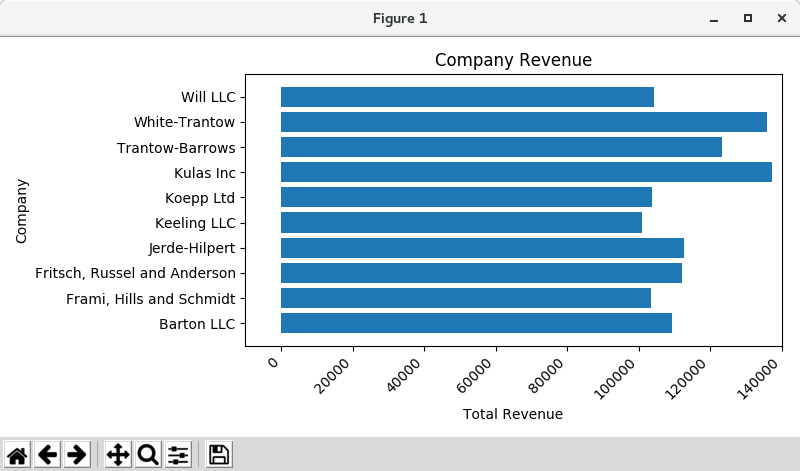

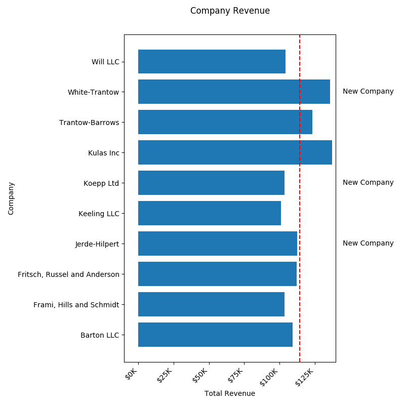
ラベルの場合、ticker.FuncFormatter クラスを使用して、関数の形式でカスタム書式のガイドラインを指定できます。 以下では、整数を入力として受け取り、文字列を出力として返す関数を定義します。
def currency(x, pos):
    """The two args are the value and tick position"""
    if x >= 1e6:
        s = '${:1.1f}M'.format(x*1e-6)
    else:
        s = '${:1.0f}K'.format(x*1e-3)
    return s

formatter = FuncFormatter(currency)
このフォーマッタをプロット上のラベルに適用することができます。 これを行うには、Axis の xaxis 属性を使用します。 これにより、プロット上の特定の軸でアクションを実行できます。
# sphinx_gallery_thumbnail_number = 10
import numpy as np
import matplotlib.pyplot as plt
from matplotlib.ticker import FuncFormatter

def currency(x, pos):
    """The two args are the value and tick position"""
    if x >= 1e6:
        s = '${:1.1f}M'.format(x*1e-6)
    else:
        s = '${:1.0f}K'.format(x*1e-3)
    return s


formatter = FuncFormatter(currency)

data = {'Barton LLC': 109438.50,
        'Frami, Hills and Schmidt': 103569.59,
        'Fritsch, Russel and Anderson': 112214.71,
        'Jerde-Hilpert': 112591.43,
        'Keeling LLC': 100934.30,
        'Koepp Ltd': 103660.54,
        'Kulas Inc': 137351.96,
        'Trantow-Barrows': 123381.38,
        'White-Trantow': 135841.99,
        'Will LLC': 104437.60}
group_data = list(data.values())
group_names = list(data.keys())
group_mean = np.mean(group_data)

plt.rcParams.update({'figure.autolayout': True})

fig, ax = plt.subplots(figsize=(6, 8))
ax.barh(group_names, group_data)
labels = ax.get_xticklabels()
plt.setp(labels, rotation=45, horizontalalignment='right')
ax.set(xlim=[-10000, 140000], xlabel='Total Revenue', ylabel='Company',
       title='Company Revenue')
ax.xaxis.set_major_formatter(formatter)

plt.show()

- Combining multiple visualizations
axes.Axes の同じインスタンス上に複数のプロット要素を描画することは可能です。 これを行うには、単にその Axes オブジェクトの plot メソッドの別の 1 つを呼び出すだけです。
# sphinx_gallery_thumbnail_number = 10
import numpy as np
import matplotlib.pyplot as plt
from matplotlib.ticker import FuncFormatter

def currency(x, pos):
    """The two args are the value and tick position"""
    if x >= 1e6:
        s = '${:1.1f}M'.format(x*1e-6)
    else:
        s = '${:1.0f}K'.format(x*1e-3)
    return s


formatter = FuncFormatter(currency)

data = {'Barton LLC': 109438.50,
        'Frami, Hills and Schmidt': 103569.59,
        'Fritsch, Russel and Anderson': 112214.71,
        'Jerde-Hilpert': 112591.43,
        'Keeling LLC': 100934.30,
        'Koepp Ltd': 103660.54,
        'Kulas Inc': 137351.96,
        'Trantow-Barrows': 123381.38,
        'White-Trantow': 135841.99,
        'Will LLC': 104437.60}
group_data = list(data.values())
group_names = list(data.keys())
group_mean = np.mean(group_data)

plt.rcParams.update({'figure.autolayout': True})

fig, ax = plt.subplots(figsize=(8, 8))
ax.barh(group_names, group_data)
labels = ax.get_xticklabels()
plt.setp(labels, rotation=45, horizontalalignment='right')

# Add a vertical line, here we set the style in the function call
ax.axvline(group_mean, ls='--', color='r')

# Annotate new companies
for group in [3, 5, 8]:
    ax.text(145000, group, "New Company", fontsize=10,
            verticalalignment="center")

# Now we'll move our title up since it's getting a little cramped
ax.title.set(y=1.05)

ax.set(xlim=[-10000, 140000], xlabel='Total Revenue', ylabel='Company',
       title='Company Revenue')
ax.xaxis.set_major_formatter(formatter)
ax.set_xticks([0, 25e3, 50e3, 75e3, 100e3, 125e3])
# fig.subplots_adjust(right=.1)

plt.show()

- Saving our plot
プロットの結果に満足しているので、ディスクに保存します。 Matplotlib に保存できるファイル形式はたくさんあります。 使用可能なオプションの一覧を表示するには、次のコマンドを使用します。
print(fig.canvas.get_supported_filetypes())
出力
{'ps': 'Postscript', 'eps': 'Encapsulated Postscript', 'pdf': 'Portable Document Format', 'pgf': 'PGF code for LaTeX', 'png': 'Portable Network Graphics', 'raw': 'Raw RGBA bitmap', 'rgba': 'Raw RGBA bitmap', 'svg': 'Scalable Vector Graphics', 'svgz': 'Scalable Vector Graphics', 'jpg': 'Joint Photographic Experts Group', 'jpeg': 'Joint Photographic Experts Group', 'tif': 'Tagged Image File Format', 'tiff': 'Tagged Image File Format'}Figure をディスクに保存するには、Figure.Figure.savefig() を使用します。 以下に示す便利なフラグがいくつかあることに注意してください。
- transparent = True は、フォーマットがサポートしている場合、保存された Figure の背景を透明にします。
- dpi = 80 は、出力の解像度( 1 平方インチあたりのドット数)を制御します。
- bbox_inches = "tight" は、Figure の境界をプロットに合わせます。
#この行のコメントを外して図を保存します。
#fig.savefig( 'sales.png'、transparent = False、dpi = 80、bbox_inches = "tight")
PNG での出力結果です。
PDF でも出力できます。sales80.pdf を見てください。
- 参照ページ
The Lifecycle of a Plot
- リリースノート
- 2023/03/11 Ver=1.03 Python 3.11.2 で確認
- 2020/10/28 Ver=1.01 Python 3.7.8 で確認
- 2018/11/08 Ver=1.01 初版リリース
- 関連ページ