|
Matplotlib で多くの図形やサイズの棒グラフ。
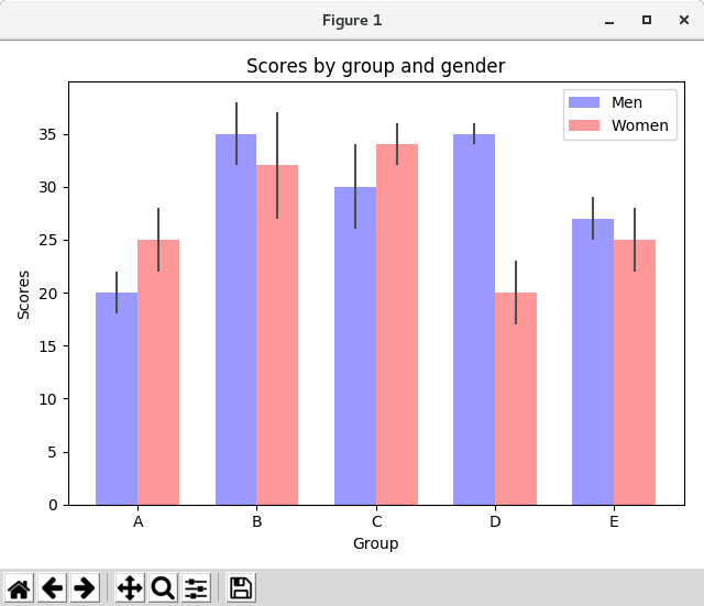
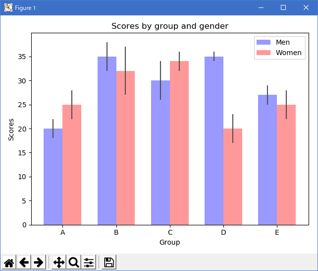
棒グラフは、数を視覚化するのに便利です。 これらの例は、Matplotlib でこれを行うためのいくつかの方法を示しています。
# Credit: Josh Hemann

import numpy as np
import matplotlib.pyplot as plt
from matplotlib.ticker import MaxNLocator
from collections import namedtuple


n_groups = 5

means_men = (20, 35, 30, 35, 27)
std_men = (2, 3, 4, 1, 2)

means_women = (25, 32, 34, 20, 25)
std_women = (3, 5, 2, 3, 3)

fig, ax = plt.subplots()

index = np.arange(n_groups)
bar_width = 0.35

opacity = 0.4
error_config = {'ecolor': '0.3'}

rects1 = ax.bar(index, means_men, bar_width,
                alpha=opacity, color='b',
                yerr=std_men, error_kw=error_config,
                label='Men')

rects2 = ax.bar(index + bar_width, means_women, bar_width,
                alpha=opacity, color='r',
                yerr=std_women, error_kw=error_config,
                label='Women')

ax.set_xlabel('Group')
ax.set_ylabel('Scores')
ax.set_title('Scores by group and gender')
ax.set_xticks(index + bar_width / 2)
ax.set_xticklabels(('A', 'B', 'C', 'D', 'E'))
ax.legend()

fig.tight_layout()
plt.show()
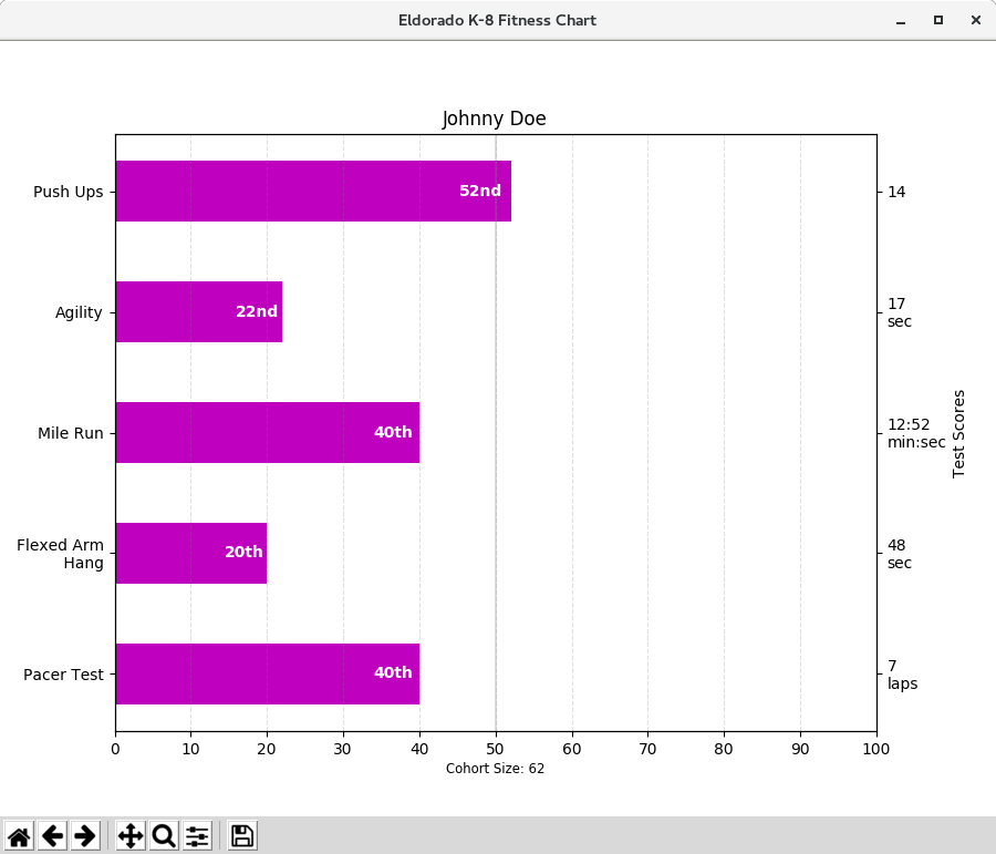
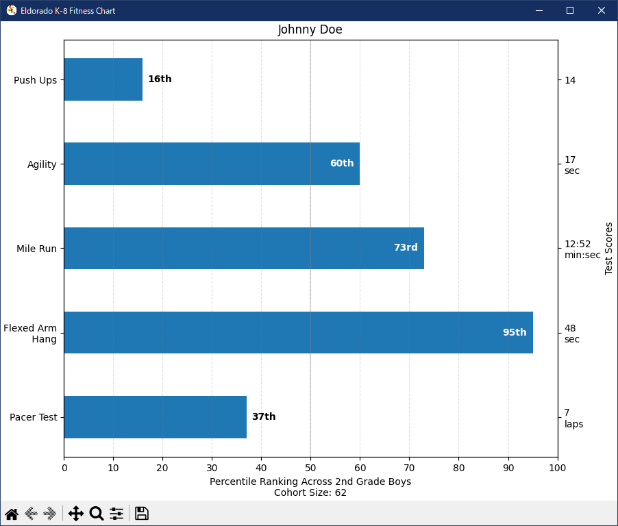
この例は、小学校のジムの教師が、少数のフィットネステストで子供がどのように行動したか、そして重要なことに、他の子供がどのように行動したかを示すことができるようにすることを目的としています。 デモ目的のプロットコードを抽出するには、ちょっとした Johnny Doe のデータを作成します。
import numpy as np
import matplotlib.pyplot as plt
from matplotlib.ticker import MaxNLocator
from collections import namedtuple


Student = namedtuple('Student', ['name', 'grade', 'gender'])
Score = namedtuple('Score', ['score', 'percentile'])

# GLOBAL CONSTANTS
testNames = ['Pacer Test', 'Flexed Arm\n Hang', 'Mile Run', 'Agility',
             'Push Ups']
testMeta = dict(zip(testNames, ['laps', 'sec', 'min:sec', 'sec', '']))


def attach_ordinal(num):
    """helper function to add ordinal string to integers

    1 -> 1st
    56 -> 56th
    """
    suffixes = {str(i): v
                for i, v in enumerate(['th', 'st', 'nd', 'rd', 'th',
                                       'th', 'th', 'th', 'th', 'th'])}

    v = str(num)
    # special case early teens
    if v in {'11', '12', '13'}:
        return v + 'th'
    return v + suffixes[v[-1]]


def format_score(scr, test):
    """
    Build up the score labels for the right Y-axis by first
    appending a carriage return to each string and then tacking on
    the appropriate meta information (i.e., 'laps' vs 'seconds'). We
    want the labels centered on the ticks, so if there is no meta
    info (like for pushups) then don't add the carriage return to
    the string
    """
    md = testMeta[test]
    if md:
        return '{0}\n{1}'.format(scr, md)
    else:
        return scr


def format_ycursor(y):
    y = int(y)
    if y < 0 or y >= len(testNames):
        return ''
    else:
        return testNames[y]


def plot_student_results(student, scores, cohort_size):
    #  create the figure
    fig, ax1 = plt.subplots(figsize=(9, 7))
    fig.subplots_adjust(left=0.115, right=0.88)
    fig.canvas.set_window_title('Eldorado K-8 Fitness Chart')

    pos = np.arange(len(testNames))

    rects = ax1.barh(pos, [scores[k].percentile for k in testNames],
                     align='center',
                     height=0.5, color='m',
                     tick_label=testNames)

    ax1.set_title(student.name)

    ax1.set_xlim([0, 100])
    ax1.xaxis.set_major_locator(MaxNLocator(11))
    ax1.xaxis.grid(True, linestyle='--', which='major',
                   color='grey', alpha=.25)

    # Plot a solid vertical gridline to highlight the median position
    ax1.axvline(50, color='grey', alpha=0.25)
    # set X-axis tick marks at the deciles
    cohort_label = ax1.text(.5, -.07, 'Cohort Size: {0}'.format(cohort_size),
                            horizontalalignment='center', size='small',
                            transform=ax1.transAxes)

    # Set the right-hand Y-axis ticks and labels
    ax2 = ax1.twinx()

    scoreLabels = [format_score(scores[k].score, k) for k in testNames]

    # set the tick locations
    ax2.set_yticks(pos)
    # make sure that the limits are set equally on both yaxis so the
    # ticks line up
    ax2.set_ylim(ax1.get_ylim())

    # set the tick labels
    ax2.set_yticklabels(scoreLabels)

    ax2.set_ylabel('Test Scores')

    ax2.set_xlabel(('Percentile Ranking Across '
                    '{grade} Grade {gender}s').format(
                        grade=attach_ordinal(student.grade),
                        gender=student.gender.title()))

    rect_labels = []
    # Lastly, write in the ranking inside each bar to aid in interpretation
    for rect in rects:
        # Rectangle widths are already integer-valued but are floating
        # type, so it helps to remove the trailing decimal point and 0 by
        # converting width to int type
        width = int(rect.get_width())

        rankStr = attach_ordinal(width)
        # The bars aren't wide enough to print the ranking inside
        if width < 5:
            # Shift the text to the right side of the right edge
            xloc = width + 1
            # Black against white background
            clr = 'black'
            align = 'left'
        else:
            # Shift the text to the left side of the right edge
            xloc = 0.98*width
            # White on magenta
            clr = 'white'
            align = 'right'

        # Center the text vertically in the bar
        yloc = rect.get_y() + rect.get_height()/2.0
        label = ax1.text(xloc, yloc, rankStr, horizontalalignment=align,
                         verticalalignment='center', color=clr, weight='bold',
                         clip_on=True)
        rect_labels.append(label)

    # make the interactive mouse over give the bar title
    ax2.fmt_ydata = format_ycursor
    # return all of the artists created
    return {'fig': fig,
            'ax': ax1,
            'ax_right': ax2,
            'bars': rects,
            'perc_labels': rect_labels,
            'cohort_label': cohort_label}

student = Student('Johnny Doe', 2, 'boy')
scores = dict(zip(testNames,
                  (Score(v, p) for v, p in
                   zip(['7', '48', '12:52', '17', '14'],
                       np.round(np.random.uniform(0, 1,
                                                  len(testNames))*100, 0)))))
cohort_size = 62  # The number of other 2nd grade boys

arts = plot_student_results(student, scores, cohort_size)
plt.show()
Python 3.11.2 見直しました。上記のコードでは、下記のエラーが発生します。
Traceback (most recent call last):
File "_:\10_Bar_charts\Bar_charts_02.py", line 146, in
arts = plot_student_results(student, scores, cohort_size)
^^^^^^^^^^^^^^^^^^^^^^^^^^^^^^^^^^^^^^^^^^^^^^^^^^
File "_:\10_Bar_charts\Bar_charts_02.py", line 61, in plot_student_results
fig.canvas.set_window_title('Eldorado K-8 Fitness Chart')
^^^^^^^^^^^^^^^^^^^^^^^^^^^
AttributeError: 'FigureCanvasTkAgg' object has no attribute 'set_window_title'
from collections import namedtuple
import numpy as np
import matplotlib.pyplot as plt


Student = namedtuple('Student', ['name', 'grade', 'gender'])
Score = namedtuple('Score', ['value', 'unit', 'percentile'])


def to_ordinal(num):
    """Convert an integer to an ordinal string, e.g. 2 -> '2nd'."""
    suffixes = {str(i): v
                for i, v in enumerate(['th', 'st', 'nd', 'rd', 'th',
                                       'th', 'th', 'th', 'th', 'th'])}
    v = str(num)
    # special case early teens
    if v in {'11', '12', '13'}:
        return v + 'th'
    return v + suffixes[v[-1]]


def format_score(score):
    """
    Create score labels for the right y-axis as the test name followed by the
    measurement unit (if any), split over two lines.
    """
    return f'{score.value}\n{score.unit}' if score.unit else str(score.value)


def plot_student_results(student, scores_by_test, cohort_size):
    fig, ax1 = plt.subplots(figsize=(9, 7), layout='constrained')
    fig.canvas.manager.set_window_title('Eldorado K-8 Fitness Chart')

    ax1.set_title(student.name)
    ax1.set_xlabel(
        'Percentile Ranking Across {grade} Grade {gender}s\n'
        'Cohort Size: {cohort_size}'.format(
            grade=to_ordinal(student.grade),
            gender=student.gender.title(),
            cohort_size=cohort_size))

    test_names = list(scores_by_test.keys())
    percentiles = [score.percentile for score in scores_by_test.values()]

    rects = ax1.barh(test_names, percentiles, align='center', height=0.5)
    # Partition the percentile values to be able to draw large numbers in
    # white within the bar, and small numbers in black outside the bar.
    large_percentiles = [to_ordinal(p) if p > 40 else '' for p in percentiles]
    small_percentiles = [to_ordinal(p) if p <= 40 else '' for p in percentiles]
    ax1.bar_label(rects, small_percentiles,
                  padding=5, color='black', fontweight='bold')
    ax1.bar_label(rects, large_percentiles,
                  padding=-32, color='white', fontweight='bold')

    ax1.set_xlim([0, 100])
    ax1.set_xticks([0, 10, 20, 30, 40, 50, 60, 70, 80, 90, 100])
    ax1.xaxis.grid(True, linestyle='--', which='major',
                   color='grey', alpha=.25)
    ax1.axvline(50, color='grey', alpha=0.25)  # median position

    # Set the right-hand Y-axis ticks and labels
    ax2 = ax1.twinx()
    # Set equal limits on both yaxis so that the ticks line up
    ax2.set_ylim(ax1.get_ylim())
    # Set the tick locations and labels
    ax2.set_yticks(
        np.arange(len(scores_by_test)),
        labels=[format_score(score) for score in scores_by_test.values()])

    ax2.set_ylabel('Test Scores')


student = Student(name='Johnny Doe', grade=2, gender='Boy')
scores_by_test = {
    'Pacer Test': Score(7, 'laps', percentile=37),
    'Flexed Arm\n Hang': Score(48, 'sec', percentile=95),
    'Mile Run': Score('12:52', 'min:sec', percentile=73),
    'Agility': Score(17, 'sec', percentile=60),
    'Push Ups': Score(14, '', percentile=16),
}

plot_student_results(student, scores_by_test, cohort_size=62)
plt.show()
|