|
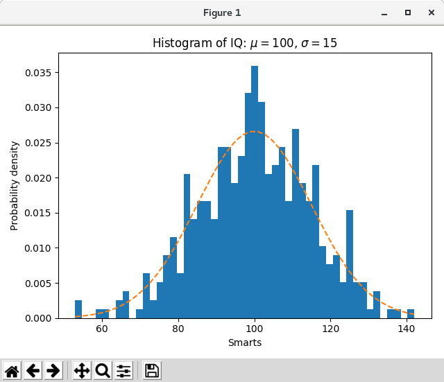
基本的なヒストグラムに加えて、このデモではいくつかのオプション機能を示します。
- データビンの数を設定する。
- ヒストグラムの積分が1になるようにビンの高さを正規化するノーマルフラグ。ヒストグラムは確率密度関数の近似値です。
- バーの顔色を設定する。
- 不透明度(アルファ値)の設定。
異なるビンの数とサイズを選択すると、ヒストグラムの形に大きく影響する場合があります。 Astropy のドキュメントには、これらのパラメータの選択方法に関する素晴らしいセクションがあります。
import matplotlib
import numpy as np
import matplotlib.pyplot as plt

np.random.seed(19680801)

# example data
mu = 100  # mean of distribution
sigma = 15  # standard deviation of distribution
x = mu + sigma * np.random.randn(437)

num_bins = 50

fig, ax = plt.subplots()

# the histogram of the data
n, bins, patches = ax.hist(x, num_bins, density=1)

# add a 'best fit' line
y = ((1 / (np.sqrt(2 * np.pi) * sigma)) *
     np.exp(-0.5 * (1 / sigma * (bins - mu))**2))
ax.plot(bins, y, '--')
ax.set_xlabel('Smarts')
ax.set_ylabel('Probability density')
ax.set_title(r'Histogram of IQ: $\mu=100$, $\sigma=15$')

# Tweak spacing to prevent clipping of ylabel
fig.tight_layout()
plt.show()
|