|
| matplotlib Pyplot tutorial. |
H.Kamifuji . |
- 目 次
- Pyplot tutorial
pyplot インターフェイスの紹介。
- Intro to pyplot
matplotlib.pyplot は、matplotlib を MATLAB のように動作させるコマンドスタイル関数のコレクションです。 各 pyplot 関数は、図形を作成したり、図形内にプロット領域を作成したり、プロット領域に線をプロットしたり、ラベルなどでプロットを飾ったりするなど、図形を少し変更します。
matplotlib.pyplot では、さまざまな状態が関数呼び出し全体で保持されるため、現在の Figure と描画領域のようなものを追跡し、プロット関数は現在の Axes に向けられます(ここの "axes" と ドキュメンテーションは、図の軸部分 を指し、1 つ以上の軸の厳密な数学用語ではない)。
注意
Pyplot API は、一般に、オブジェクト指向APIより柔軟性が低い。 ここに表示されているほとんどの関数呼び出しは、Axes オブジェクトからメソッドとして呼び出すこともできます。 チュートリアルとサンプルをブラウズして、これがどのように機能するかを確認することをお勧めします。
pyplotで可視化を生成するのは非常に簡単です:
import matplotlib.pyplot as plt
plt.plot([1, 2, 3, 4])
plt.ylabel('some numbers')
plt.show()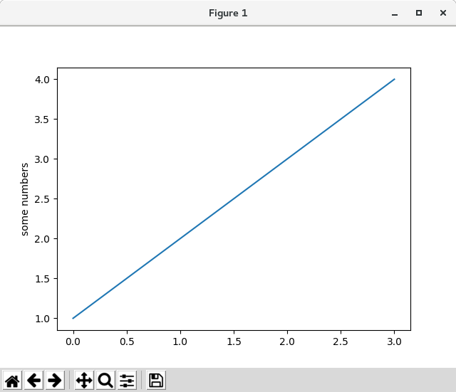
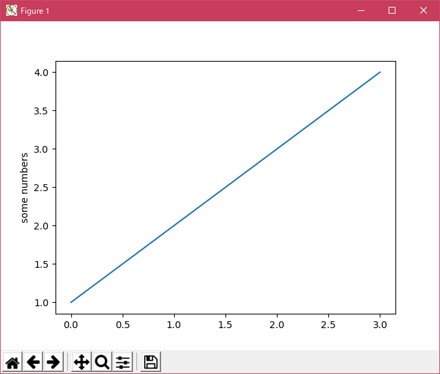
x 軸の範囲が 0-3 で、y 軸が 1 から 4 の範囲であるのか疑問に思うかもしれません。 plot() コマンドに単一のリストまたは配列を指定すると、matplotlib はそれが y 値のシーケンスであるとみなし、自動的に x 値を生成します。 Python の範囲は 0 から始まるので、デフォルトの x ベクトルは y と同じ長さですが 0 から始まります。したがって、x データは [0,1,2,3] です。
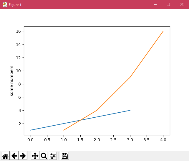
plot() は多目的なコマンドで、任意の数の引数をとります。 たとえば、x と y をプロットするには、次のコマンドを実行します。
import matplotlib.pyplot as plt

plt.plot([1, 2, 3, 4])
plt.plot([1, 2, 3, 4], [1, 4, 9, 16])

plt.ylabel('some numbers')
plt.show()
- Formatting the style of your plot
引数の x、y の組ごとに、プロットの色と線種を示す書式文字列であるオプションの第3引数があります。 書式文字列の文字と記号は MATLAB からのもので、カラー文字列と線スタイル文字列を連結します。 デフォルトの書式文字列は 'b-' で、青色の実線です。 たとえば、上に赤い円でプロットするには、
import matplotlib.pyplot as plt

plt.plot([1, 2, 3, 4], [1, 4, 9, 16], 'ro')
plt.axis([0, 6, 0, 20])

plt.show()


ラインスタイルとフォーマット文字列の完全なリストについては、plot() のドキュメントを参照してください。 上記の例の axis() コマンドは [xmin、xmax、ymin、ymax] のリストを取り、軸のビューポートを指定します。
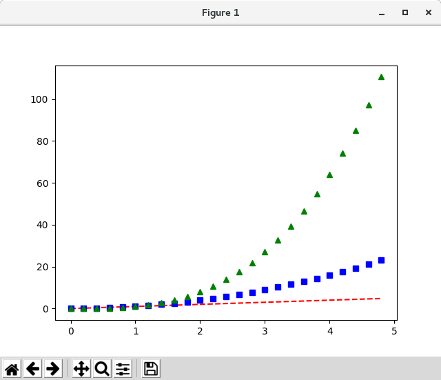
matplotlib がリストを扱うことに限定されていた場合、数値処理にはまったく役に立たないでしょう。 一般的に、numpy 配列を使用します。 実際、すべてのシーケンスは内部的に numpy 配列に変換されます。 下の例は、配列を使用して 1 つのコマンドで異なる書式スタイルを持つ複数の行をプロットする方法を示しています。
import matplotlib.pyplot as plt

import numpy as np

# evenly sampled time at 200ms intervals
t = np.arange(0., 5., 0.2)

# red dashes, blue squares and green triangles
plt.plot(t, t, 'r--', t, t**2, 'bs', t, t**3, 'g^')

plt.show()

- Plotting with keyword strings
特定の変数に文字列でアクセスできる形式のデータがある場合があります。 たとえば、numpy.recarray または pandas.DataFrame を使用します。
Matplotlib では、そのようなオブジェクトに data キーワード引数を指定できます。 提供されている場合は、これらの変数に対応する文字列でプロットを生成することができます。
import matplotlib.pyplot as plt

import numpy as np

data = {'a': np.arange(50),
        'c': np.random.randint(0, 50, 50),
        'd': np.random.randn(50)}
data['b'] = data['a'] + 10 * np.random.randn(50)
data['d'] = np.abs(data['d']) * 100

plt.scatter('a', 'b', c='c', s='d', data=data)
plt.xlabel('entry a')
plt.ylabel('entry b')

plt.show()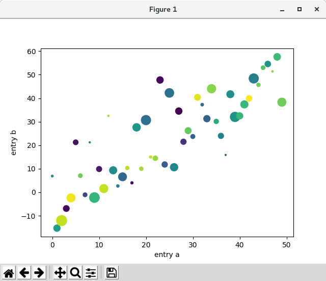

- Plotting with categorical variables
カテゴリ変数を使用してプロットを作成することもできます。 Matplotlib では、カテゴリ変数を多くのプロット関数に直接渡すことができます。 例えば:
import matplotlib.pyplot as plt

import numpy as np

names = ['group_a', 'group_b', 'group_c']
values = [1, 10, 100]

plt.figure(1, figsize=(9, 3))

plt.subplot(131)
plt.bar(names, values)

plt.subplot(132)
plt.scatter(names, values)

plt.subplot(133)
plt.plot(names, values)

plt.suptitle('Categorical Plotting')

plt.show()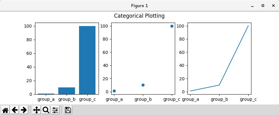
- Controlling line properties
行には、線幅、ダッシュスタイル、アンチエイリアスなど、多くの属性を設定できます。 matplotlib.lines.Line2D を参照してください。 行のプロパティを設定するにはいくつかの方法があります
-
キーワードargsを使用する:
plt.plot(x, y, linewidth=2.0)
-
Line2D インスタンスの setter メソッドを使用します。 plotはLine2D オブジェクトのリストを返します。 例えば、line1, line2 = plot(x1, y1, x2, y2) 。 下のコードでは、返されるリストの長さが 1 になるように1行しかないと仮定します。タプルを展開して、そのリストの最初の要素を取得します。
line, = plt.plot(x, y, '-')
line.set_antialiased(False) # turn off antialising
-
setp() コマンドを使用します。 以下の例では、MATLAB スタイルのコマンドを使用して、行のリストに複数のプロパティを設定しています。 setp は、オブジェクトのリストまたは単一のオブジェクトで透過的に動作します。 python キーワード引数またはMATLAB形式の文字列/値のペアを使用できます。
lines = plt.plot(x1, y1, x2, y2)
# use keyword args
plt.setp(lines, color='r', linewidth=2.0)
# or MATLAB style string value pairs
plt.setp(lines, 'color', 'r', 'linewidth', 2.0)
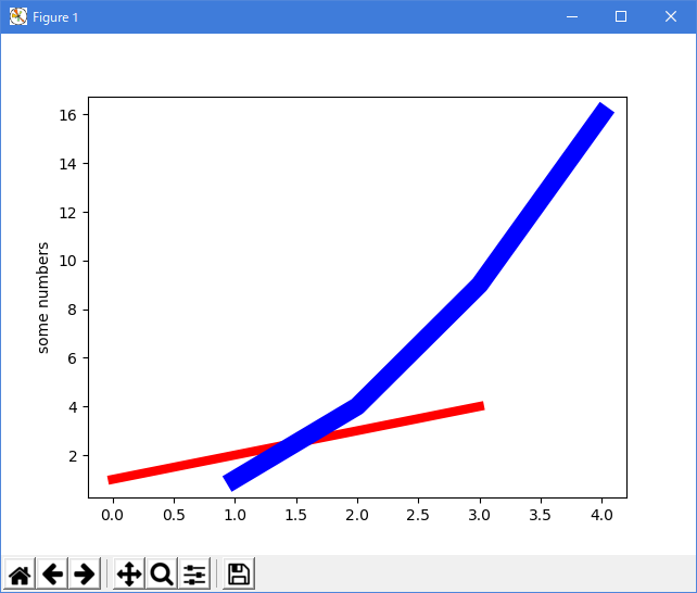
import matplotlib.pyplot as plt

lines = plt.plot([1, 2, 3, 4])
plt.setp(lines, 'color', 'r', 'linewidth', 6.0)

lines = plt.plot([1, 2, 3, 4], [1, 4, 9, 16])
plt.setp(lines, 'color', 'b', 'linewidth', 12.0)

plt.ylabel('some numbers')
plt.show()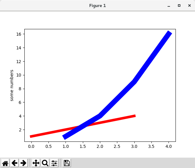
利用可能なLine2Dプロパティを次に示します。
Property Value Type alpha float animated [True | False] antialiased or aa [True | False] clip_box a matplotlib.transform.Bbox instance clip_on [True | False] clip_path a Path instance and a Transform instance, a Patch color or c any matplotlib color contains the hit testing function dash_capstyle ['butt' | 'round' | 'projecting'] dash_joinstyle ['miter' | 'round' | 'bevel'] dashes sequence of on/off ink in points data (np.array xdata, np.array ydata) figure a matplotlib.figure.Figure instance label any string linestyle or ls [ '-' | '--' | '-.' | ':' | 'steps' | ...] linewidth or lw float value in points lod [True | False] marker [ '+' | ',' | '.' | '1' | '2' | '3' | '4' ] markeredgecolor or mec any matplotlib color markeredgewidth or mew float value in points markerfacecolor or mfc any matplotlib color markersize or ms float markevery [ None | integer | (startind, stride) ] picker used in interactive line selection pickradius the line pick selection radius solid_capstyle ['butt' | 'round' | 'projecting'] solid_joinstyle ['miter' | 'round' | 'bevel'] transform a matplotlib.transforms.Transform instance visible [True | False] xdata np.array ydata np.array zorder any number
設定可能な行プロパティのリストを取得するには、setp() 関数を引数として1つまたは複数の行で呼び出します
In [69]: lines = plt.plot([1, 2, 3])

In [70]: plt.setp(lines)
  alpha: float
  animated: [True | False]
  antialiased or aa: [True | False]
  ...snip
-
キーワードargsを使用する:
- Working with multiple figures and axes
MATLAB と pyplot は、現在の Figure と現在の Axes という概念を持っています。 すべてのプロットコマンドは、現在の軸に適用されます。 関数 gca() は現在の軸( matplotlib.axes.Axes インスタンス)を返し、gcf() は現在の Figure( matplotlib.figure.Figure インスタンス)を返します。 通常、あなたはこれについて心配する必要はありません。なぜなら、すべての場面の背後に世話をしているからです。 以下は、2 つのサブプロットを作成するためのスクリプトです。
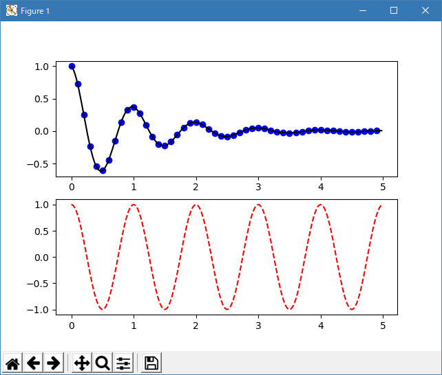
import matplotlib.pyplot as plt
import numpy as np

def f(t):
    return np.exp(-t) * np.cos(2*np.pi*t)

t1 = np.arange(0.0, 5.0, 0.1)
t2 = np.arange(0.0, 5.0, 0.02)

plt.figure(1)
plt.subplot(211)
plt.plot(t1, f(t1), 'bo', t2, f(t2), 'k')

plt.subplot(212)
plt.plot(t2, np.cos(2*np.pi*t2), 'r--')

plt.show()
手動で軸を指定しないと、デフォルトでサブプロット (111) が作成されるのと同じように、figure(1) はデフォルトで作成されるため、ここの figure() コマンドはオプションです。 subplot() コマンドは、numrows、numcols、plot_number を指定します。ここで、plot_number は 1 から numrows * numcols の範囲です。 numrows * numcols > 10 の場合、subplot コマンドのカンマはオプションです。 したがって、サブプロット (211) はサブプロット (2,1,1) と同じです。
任意の数のサブプロットと軸を作成できます。 軸を手動で、つまり長方形のグリッド上に配置しない場合は、軸( [left、bottom、width、height] )として位置を指定できる axes() コマンドを使用します。 (0?1) 座標である。 軸を手動で配置する例については Axes Demo を、サブプロットの多い例については Basic Subplot Demo を参照してください。
Figure 数が増えている複数の Figure() 呼び出しを使用して複数の Figure を作成できます。 もちろん、各図には、あなたの心が望むだけの数の軸とサブプロットを含めることができます:
import matplotlib.pyplot as plt
plt.figure(1)                # the first figure
plt.subplot(211)             # the first subplot in the first figure
plt.plot([1, 2, 3])
plt.subplot(212)             # the second subplot in the first figure
plt.plot([4, 5, 6])

plt.figure(2)                # a second figure
plt.plot([4, 5, 6])          # creates a subplot(111) by default

plt.figure(1)                # figure 1 current; subplot(212) still current
plt.subplot(211)             # make subplot(211) in figure1 current
plt.title('Easy as 1, 2, 3') # subplot 211 title
clf() で現在のFigureをクリアし、cla() で現在の Axes をクリアすることができます。 あなたが舞台裏であなたのために状態(具体的には現在の画像、図形、および軸)が維持されているのを迷惑に感じるなら、これは絶望的ではありません。これはオブジェクト指向の API を取り巻く薄いステートフルなラッパーです アーティストチュートリアル を参照してください)
たくさんの図形を作成している場合は、さらにもう一つ知っておく必要があります。図形に必要なメモリは、Figure が close() で明示的に閉じられるまで完全に解放されません。 pyplot は close() が呼び出されるまで内部参照を保持しているので、Figure へのすべての参照を削除したり、ウィンドウマネージャを使用して Figure が画面に表示されているウィンドウを強制終了したりすることは十分ではありません。
- Working with text
text() コマンドは、テキストを任意の場所に追加するために使用でき、xlabel() 、ylabel() 、title() は、指定された場所にテキストを追加するために使用されます(詳細は Matplotlib Plots のテキスト, を参照してください)
import matplotlib.pyplot as plt
import numpy as np

mu, sigma = 100, 15
x = mu + sigma * np.random.randn(10000)

# the histogram of the data
n, bins, patches = plt.hist(x, 50, density=1, facecolor='g', alpha=0.75)

plt.xlabel('Smarts')
plt.ylabel('Probability')
plt.title('Histogram of IQ')
plt.text(60, .025, r'$\mu=100,\ \sigma=15$')
plt.axis([40, 160, 0, 0.03])
plt.grid(True)

plt.show()
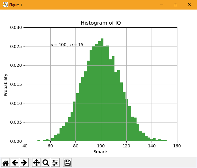
すべての text() コマンドは、matplotlib.text.Text インスタンスを返します。 上記のように、キーワード引数をテキスト関数に渡すか、setp() を使ってプロパティをカスタマイズすることができます:
t = plt.xlabel('my data', fontsize=14, color='red')これらのプロパティの詳細については、「テキストのプロパティとレイアウト 」を参照してください。
- Using mathematical expressions in text
matplotlib は、任意のテキスト式でTeXの式の式を受け入れます。 たとえば、タイトルに式を書くには、ドル記号で囲まれたTeX式を書くことができます。
plt.title(r'$\sigma_i=15$')
タイトル文字列に先行する r は重要です。文字列は生の文字列であり、バックスラッシュは Python のエスケープとして扱われません。 matplotlib には、組み込みの TeX 式パーサとレイアウトエンジンがあり、独自の数式フォントが付属しています。詳しくは、数式の記述を参照 してください。 したがって、TeX のインストールを必要とせずに、数学的なテキストをプラットフォーム間で使用することができます。 LaTeXとdvipng がインストールされている人には、LaTeX を使ってテキストを書式設定し、その出力をディスプレイの図や保存されたポストスクリプトに直接組み込むことができます - LaTeX でのテキストレンダリングを参照 してください。
- Annotating text
上記の基本的な text() コマンドの使用は、テキストを Axes の任意の位置に置きます。 テキストの一般的な使い方は、プロットの一部のフィーチャに注釈を付けることです。また、annotate() メソッドは、注釈を簡単にするためのヘルパ機能を提供します。 注釈では、考慮すべき 2 つの点があります:引数 xy で表される注釈付きの位置とテキスト xytext の位置です。 これらの引数は(x、y)タプルです。
import matplotlib.pyplot as plt
import numpy as np

ax = plt.subplot(111)

t = np.arange(0.0, 5.0, 0.01)
s = np.cos(2*np.pi*t)
line, = plt.plot(t, s, lw=2)

plt.annotate('local max', xy=(2, 1), xytext=(3, 1.5),
             arrowprops=dict(facecolor='black', shrink=0.05),
             )

plt.ylim(-2, 2)

plt.show()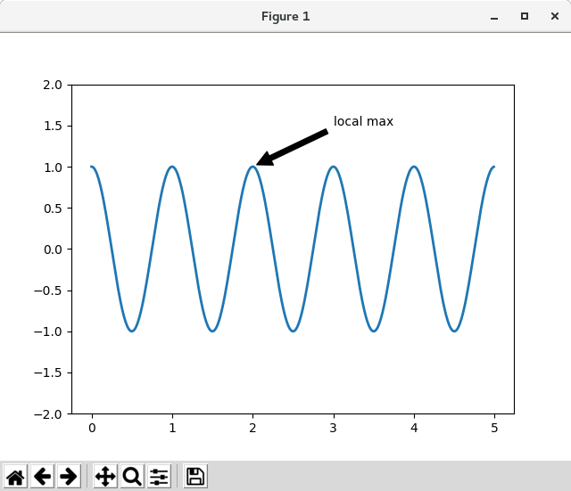

この基本例では、xy (矢印の先端)と xytext の位置(テキストの位置)の両方がデータ座標にあります。 選択できるさまざまな座標系があります。詳しくは、「基本注釈 」と「高度な注釈 」を参照してください。 その他の例は、「注釈を付ける」を参照してください。
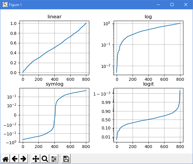
- Logarithmic and other nonlinear axes
matplotlib.pyplot は、直線軸スケールだけでなく、対数スケールとロジットスケールもサポートしています。 これは、データが多くのオーダーの大きさに及ぶ場合によく使用されます。 軸のスケールを変更するのは簡単です:
plt.xscale('log)'同じデータを持ち、y 軸のスケールが異なる4つのプロットの例を以下に示します。
import matplotlib.pyplot as plt
import numpy as np

from matplotlib.ticker import NullFormatter  # useful for `logit` scale

# Fixing random state for reproducibility
np.random.seed(19680801)

# make up some data in the interval ]0, 1[
y = np.random.normal(loc=0.5, scale=0.4, size=1000)
y = y[(y > 0) & (y < 1)]
y.sort()
x = np.arange(len(y))

# plot with various axes scales
plt.figure(1)

# linear
plt.subplot(221)
plt.plot(x, y)
plt.yscale('linear')
plt.title('linear')
plt.grid(True)


# log
plt.subplot(222)
plt.plot(x, y)
plt.yscale('log')
plt.title('log')
plt.grid(True)


# symmetric log
plt.subplot(223)
plt.plot(x, y - y.mean())
plt.yscale('symlog', linthreshy=0.01)
plt.title('symlog')
plt.grid(True)

# logit
plt.subplot(224)
plt.plot(x, y)
plt.yscale('logit')
plt.title('logit')
plt.grid(True)
# Format the minor tick labels of the y-axis into empty strings with
# `NullFormatter`, to avoid cumbering the axis with too many labels.
plt.gca().yaxis.set_minor_formatter(NullFormatter())
# Adjust the subplot layout, because the logit one may take more space
# than usual, due to y-tick labels like "1 - 10^{-3}"
plt.subplots_adjust(top=0.92, bottom=0.08, left=0.10, right=0.95, hspace=0.25,
                    wspace=0.35)

plt.show()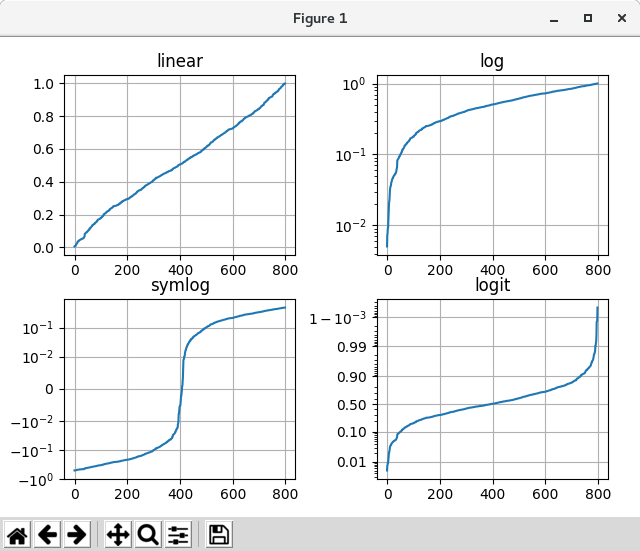
独自のスケールを追加することもできます。詳しくは、スケールと変換を作成するための開発者ガイドを参照してください。
Python 3.11.2 見直しました。上記のコードでは、下記のエラーが発生します。
File "_:\06_Pyplot_tutorial\sample_tutorial_16.py", line 37, in
plt.yscale('symlog', linthreshy=0.01)
File "C:\Users\_____\AppData\Local\Programs\Python\Python311\Lib\site-packages\matplotlib\pyplot.py", line 3113, in yscale
return gca().set_yscale(value, **kwargs)
^^^^^^^^^^^^^^^^^^^^^^^^^^^^^^^^^
File "C:\Users\_____\AppData\Local\Programs\Python\Python311\Lib\site-packages\matplotlib\axes\_base.py", line 74, in wrapper
return get_method(self)(*args, **kwargs)
^^^^^^^^^^^^^^^^^^^^^^^^^^^^^^^^^
File "C:\Users\_____\AppData\Local\Programs\Python\Python311\Lib\site-packages\matplotlib\axis.py", line 810, in _set_axes_scale
ax._axis_map[name]._set_scale(value, **kwargs)
File "C:\Users\_____\AppData\Local\Programs\Python\Python311\Lib\site-packages\matplotlib\axis.py", line 767, in _set_scale
self._scale = mscale.scale_factory(value, self, **kwargs)
^^^^^^^^^^^^^^^^^^^^^^^^^^^^^^^^^^^^^^^^^^^
File "C:\Users\_____\AppData\Local\Programs\Python\Python311\Lib\site-packages\matplotlib\scale.py", line 714, in scale_factory
return scale_cls(axis, **kwargs)
^^^^^^^^^^^^^^^^^^^^^^^^^
# Fixing random state for reproducibility import matplotlib.pyplot as plt import numpy as np np.random.seed(19680801) # make up some data in the open interval (0, 1) y = np.random.normal(loc=0.5, scale=0.4, size=1000) y = y[(y > 0) & (y < 1)] y.sort() x = np.arange(len(y)) # plot with various axes scales plt.figure() # linear plt.subplot(221) plt.plot(x, y) plt.yscale('linear') plt.title('linear') plt.grid(True) # log plt.subplot(222) plt.plot(x, y) plt.yscale('log') plt.title('log') plt.grid(True) # symmetric log plt.subplot(223) plt.plot(x, y - y.mean()) plt.yscale('symlog', linthresh=0.01) plt.title('symlog') plt.grid(True) # logit plt.subplot(224) plt.plot(x, y) plt.yscale('logit') plt.title('logit') plt.grid(True) # Adjust the subplot layout, because the logit one may take more space # than usual, due to y-tick labels like "1 - 10^{-3}" plt.subplots_adjust(top=0.92, bottom=0.08, left=0.10, right=0.95, hspace=0.25, wspace=0.35) plt.show() 
- 参照ページ
Pyplot tutorial
- リリースノート
- 2023/03/24 Ver=1.03 Python 3.11.2 で確認
- 2020/10/28 Ver=1.01 Python 3.7.8 で確認
- 2018/11/08 Ver=1.01 初版リリース
- 関連ページ